Servirental

- Industry
- Industrial
- Year
- 2023
- My role
- Identity management and symbol design at the Liberte agency
- Disciplines
- Brand identity
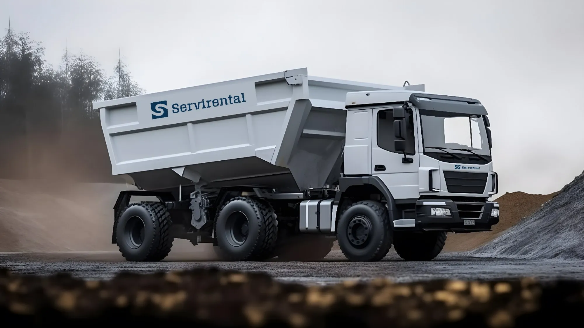
Identity for a construction aggregates and heavy machinery rental company in southern Peru.
My role
I managed the identity with the Liberte agency's design team and the client. The symbol was my option: I designed it, drawing inspiration with the help of AI. The logotype, the word Servirental, was finished by Karen Llosa, from the agency team.
The brief
Servirental sells construction aggregates, such as crushed stone, and rents heavy machinery in southern Peru. It speaks to private and public companies as well as to people building their own homes. It stood out for punctuality, delivery efficiency and credit for its clients. In the brief, the brand was a 30-year-old civil engineer with a hard hat and safety shoes: formal, confident, reliable and smart.
Solutions for the construction sector.
The idea
In the brand DNA we defined it as a massive, solid ally. Its archetype is the Creator, who turns ideas into facts and tangible objects. The brief spoke of mountains of solid rock, a riverbank and a rhinoceros: hardness and resistance, where the raw material comes from.
The logo
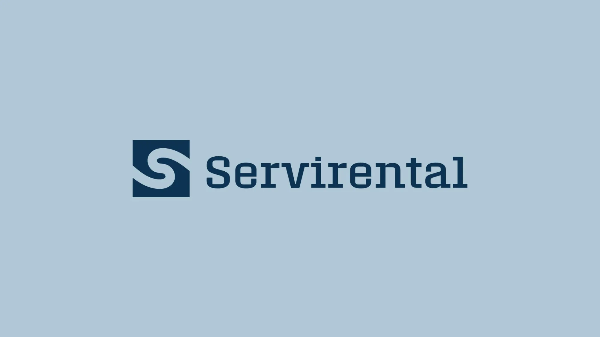
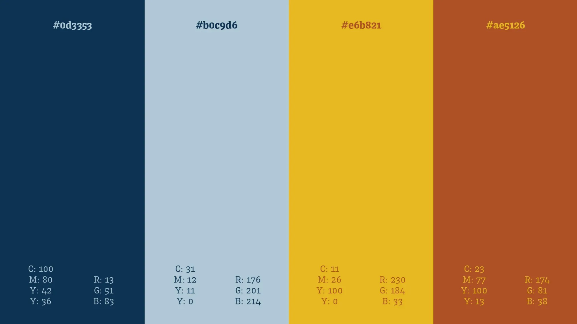
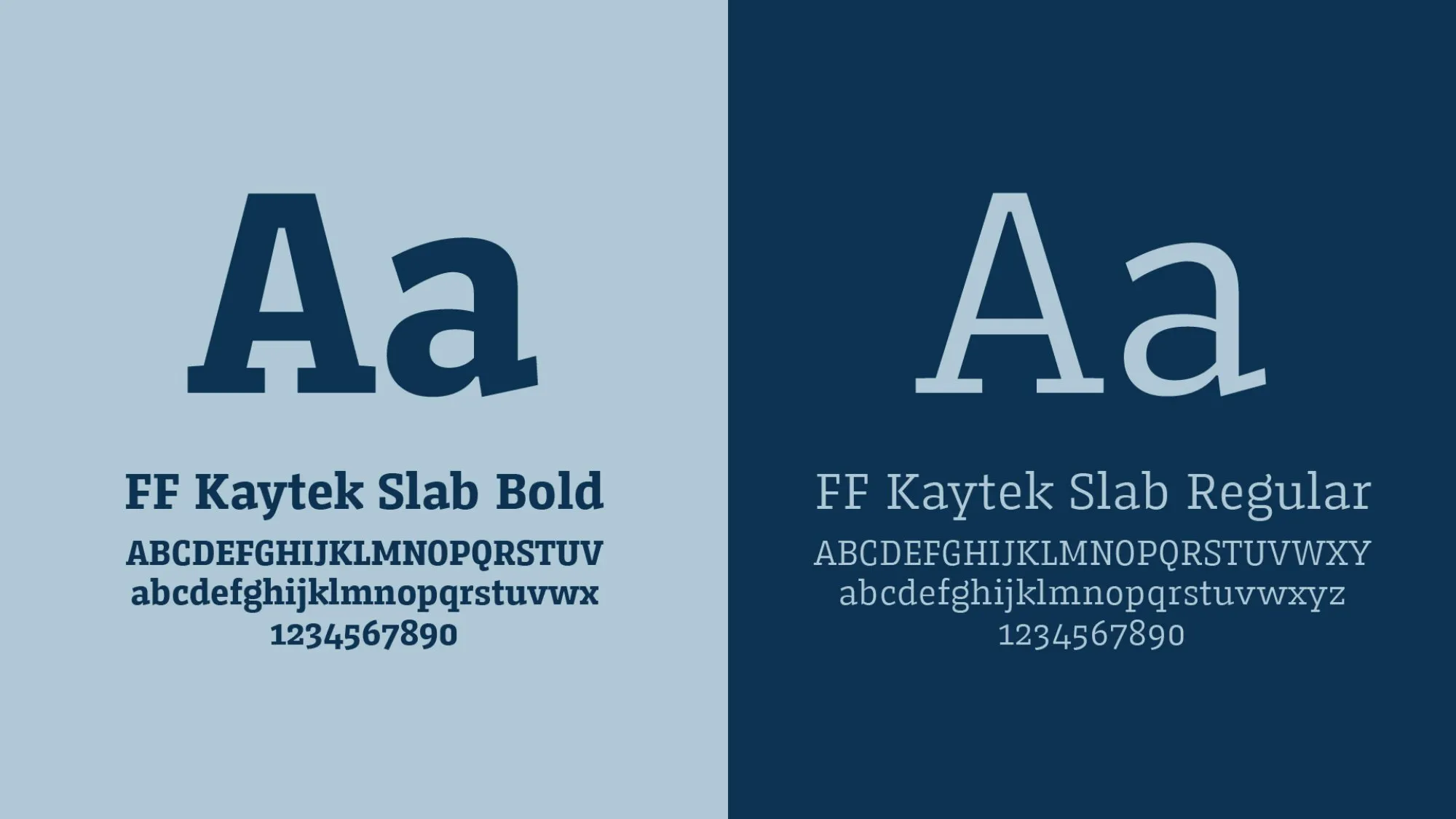
An S that makes its way inside a square block, like a road through rock, and a name in a slab serif: firm, legible and with industrial weight. Deep blue and grayish light blue bring seriousness; the yellow and orange of the machinery stay as accents.
The team
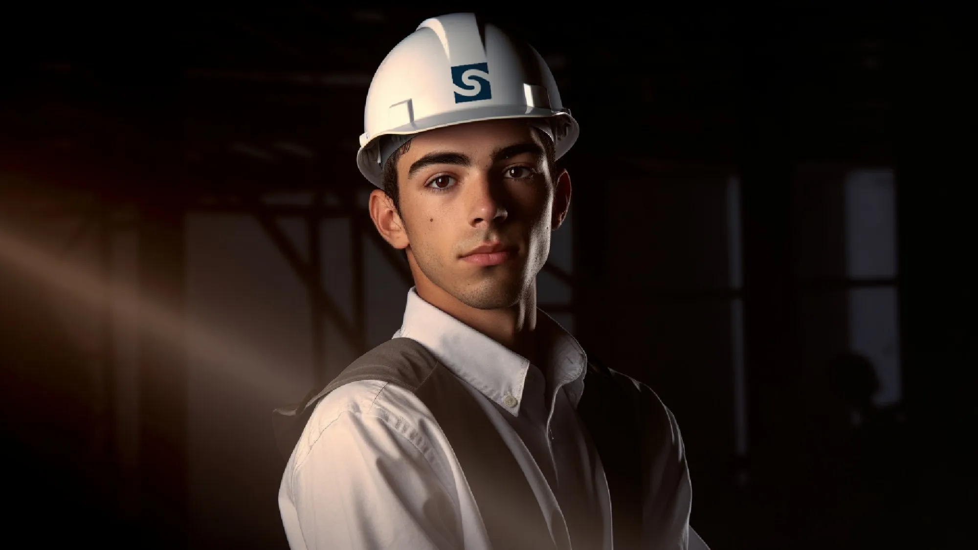
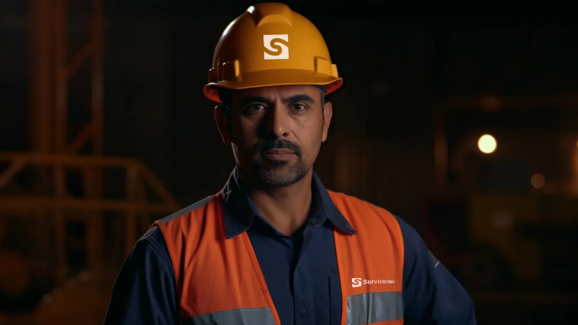
The brand on staff hard hats and uniforms, from the office to the site.
Stationery
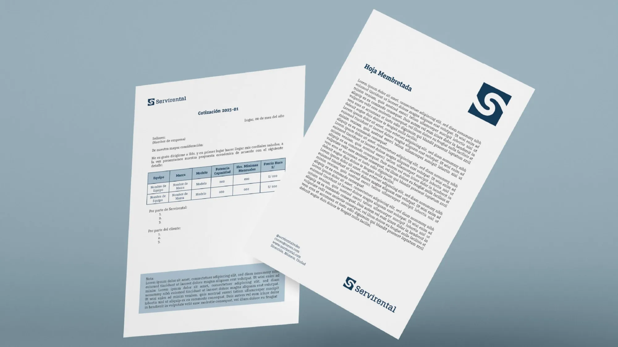
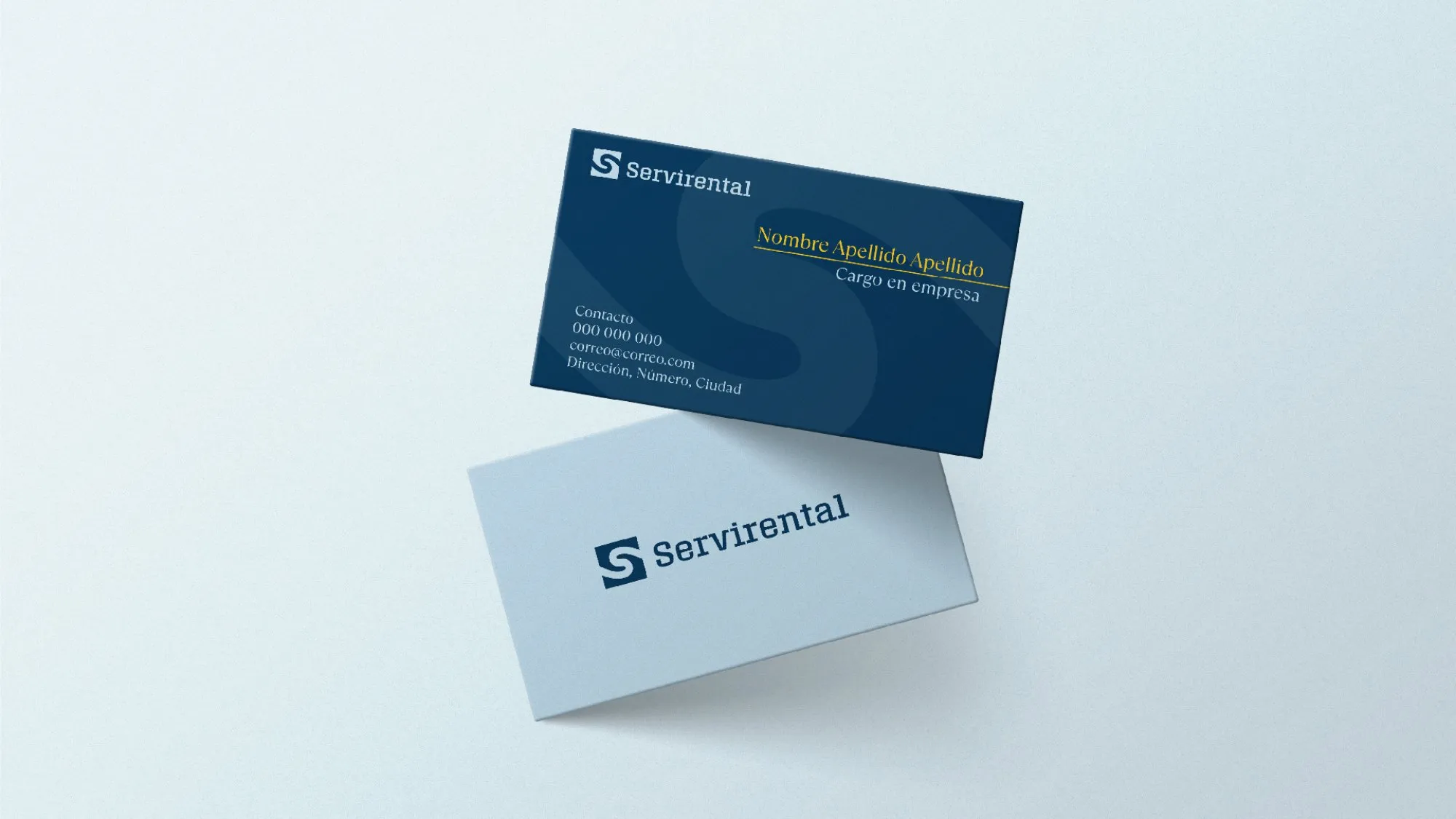
Letterhead and business cards.
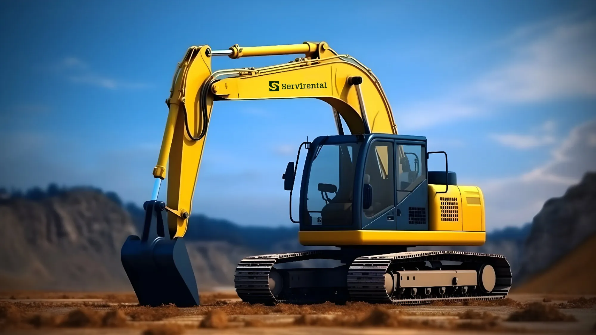
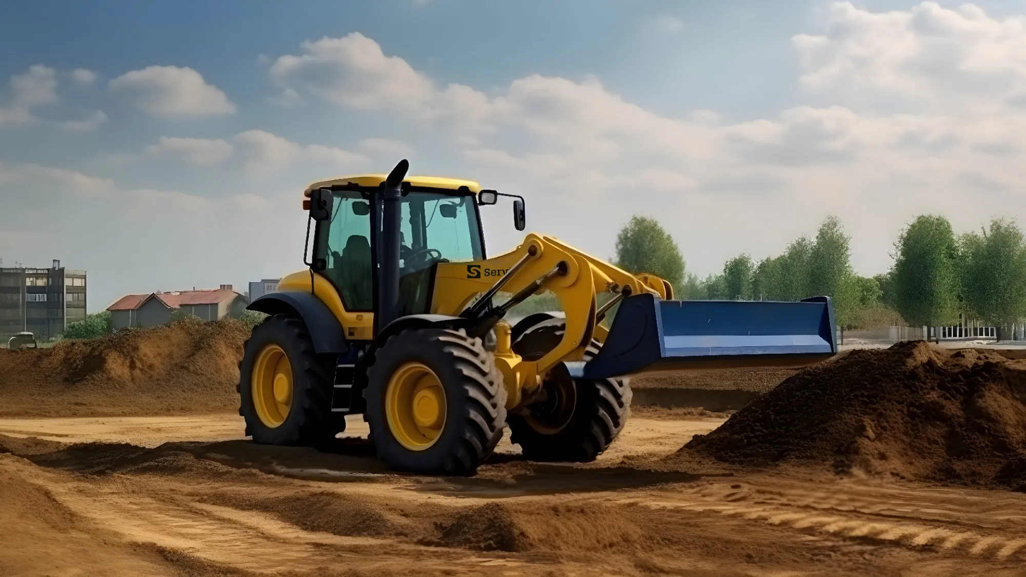
The machinery
And on the heavy machinery, as the brief asked.
Result
Servirental ended up with a complete identity, with its logo, colors, typeface and applications for its staff, machinery and stationery.
Tell me about your project.
I answer every message personally. Leave your details in the form or write to me at:
yo@alejandroadriazola.com