- Industry
- Industrial
- Year
- 2024
- My role
- Identity project management at the Liberte agency
- Disciplines
- Brand identity
The identity of an Arequipa machinery rental company that wanted to stand next to the big players.
My role
I managed the identity project. The brand was designed by one of the agency's designers; I led the process from the brief to delivery. The agency also built its website and a brochure, but my involvement there was smaller.
The brief
Quisapata rents machinery for construction and mining, sells accessories and provides technical service. It competed with much larger companies (Unimaq, Tritón, SK Rental, Ipesa) and was looking for recognition. Its advantage over them was responsiveness: spare parts in stock and fast deliveries.
A small company that had to look the size of its machinery.
The brief, in depth
The client imagined the brand as a 30-year-old heavy machinery specialist, with a white hard hat, blue shirt and safety shoes. A puma, the Peruvian highlands, rock music. The five ideas that defined it best: trust, prestige, friendship, innovation and safety. And it asked us to look at Ferreyros and Komatsu, the category benchmarks.
The symbol
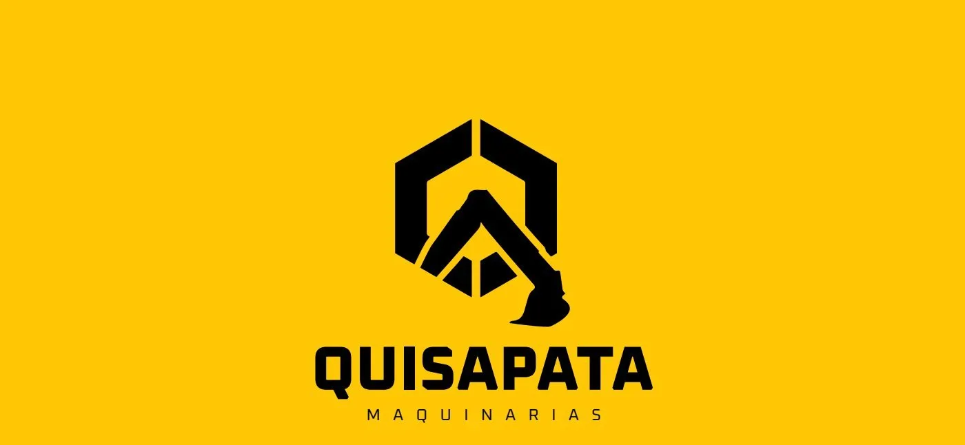
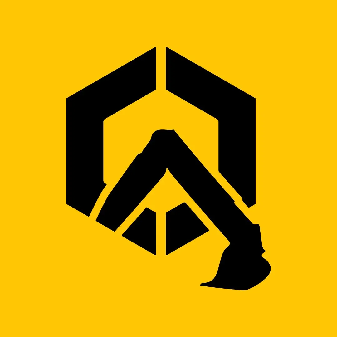
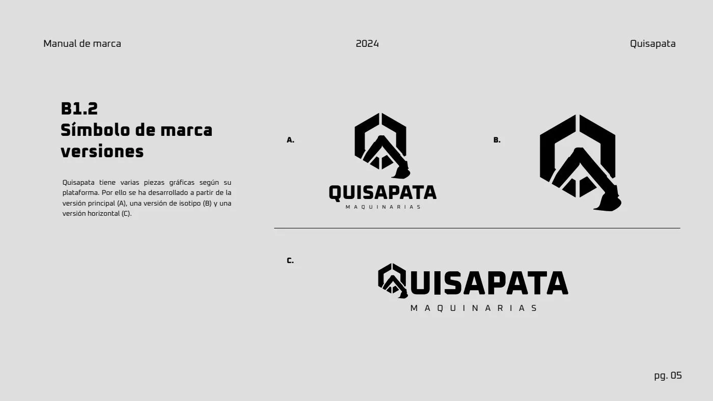
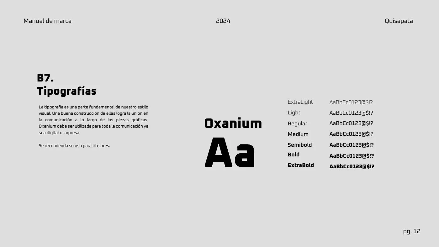
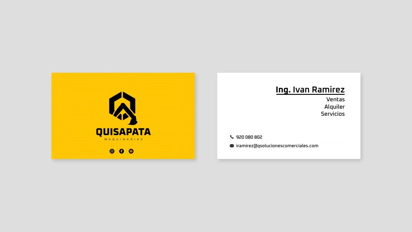
The Q was built as a hexagon, the shape of a nut, and its tail is an excavator bucket. A single stroke says what the company does without drawing a whole machine. The name is set in a wide, technical typeface (Oxanium), with MAQUINARIAS spaced out below.
The system
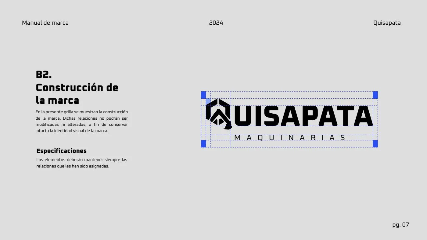
A main version, a symbol and a horizontal version, built on a grid so the brand holds up from a hard hat to a facade.
Color and typography
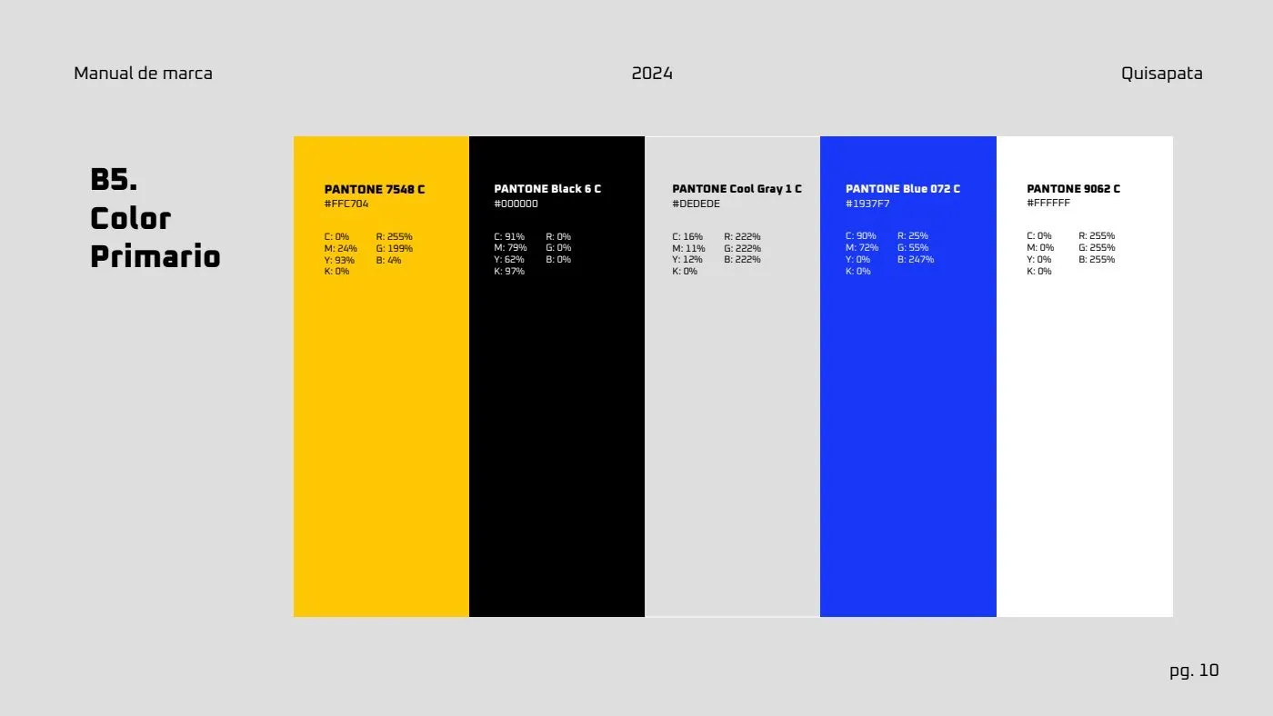
Yellow and black, the colors of heavy machinery and the ones the market already associates with the leaders. The blue the brief asked for stayed as an accent.
Applications
Result
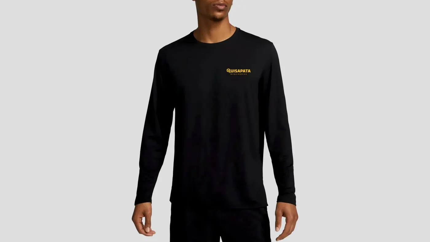
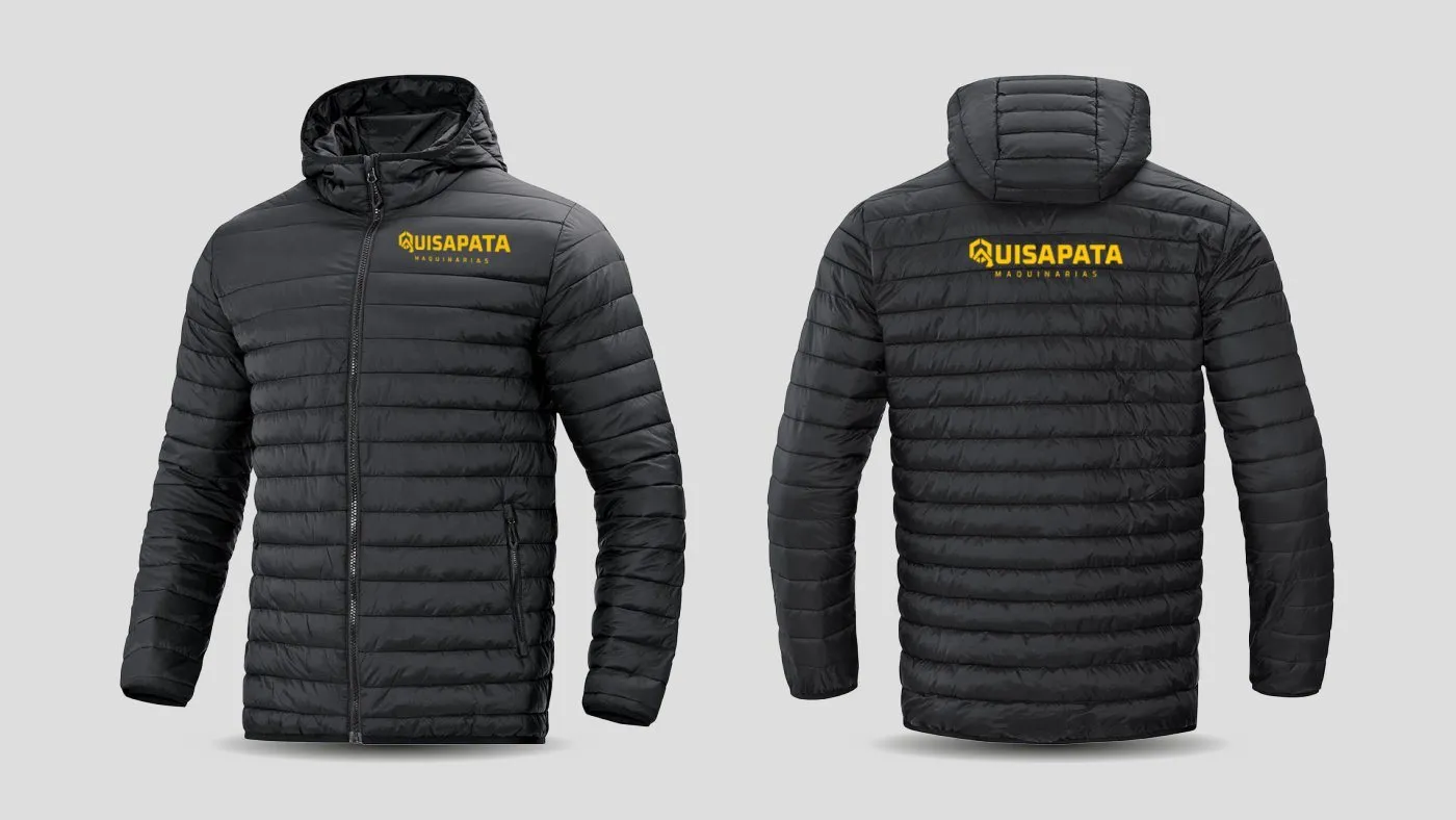
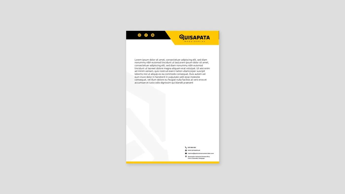
Quisapata came out with an identity on par with its competitors and took it to its website, brochure and uniforms.
Tell me about your project.
I answer every message personally. Leave your details in the form or write to me at:
yo@alejandroadriazola.com