Ocean
- Industry
- Real estate
- Year
- 2024
- My role
- Strategic planning and account management at the Liberte agency
- Disciplines
- Strategy, Brand identity
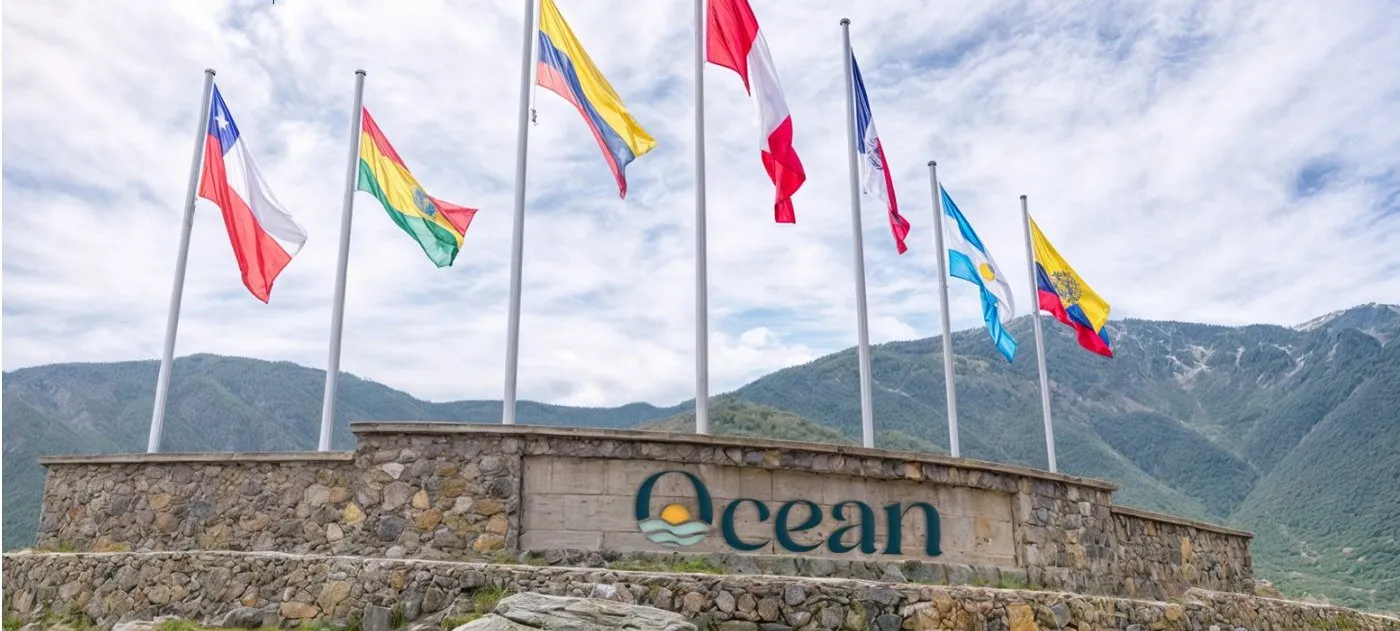
Before the logo, the market: the strategic planning and brand of a beach condominium in Camaná.
My role
I did the strategic planning: the market analysis, segmentation, positioning, pricing model and brand architecture. We did the competitor benchmarking with the agency team. The identity was designed by the agency's design team on top of that strategy.
The brief
Royal Ocean was about to launch Ocean Condominios: 56 superblocks on high ground on the Camaná coast, with residential, commercial and recreational areas. It needed to know who to sell to, who it was competing against, and how to name and organize a project of that size.
First the market, then the brand.
The market
We surveyed the direct competition in Camaná and the indirect competition in Mollendo and Mejía: more than ten second-home projects, each with its price per square meter, financing, construction progress and what its buyers said. The pattern was clear: almost all sold off-plan, and those that didn't deliver on construction carried complaints. Trust was what decided the purchase, and that was the opportunity.
Who to sell to
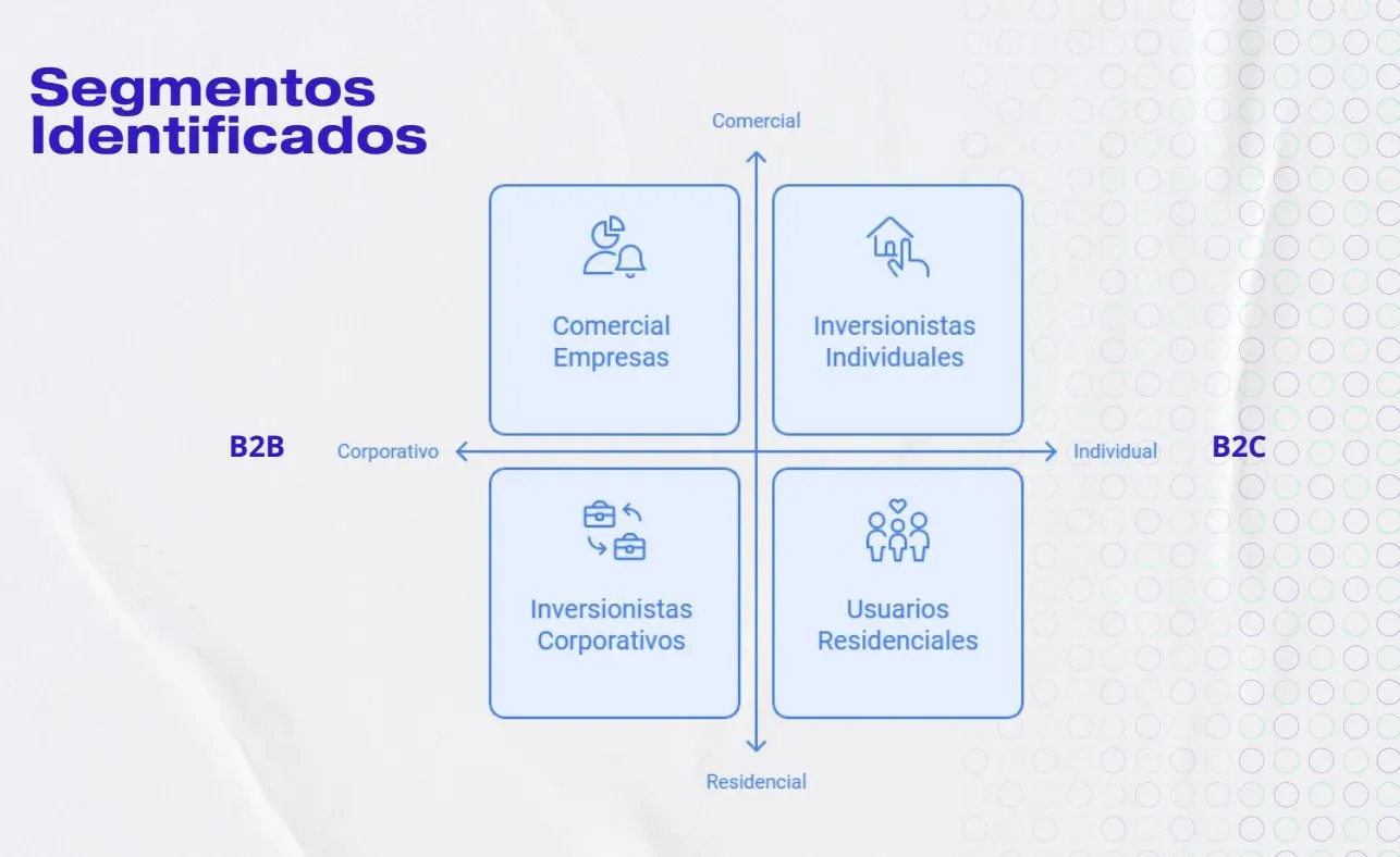
I defined four segments with different buying logics: corporate investors (mining companies and professional associations buying whole superblocks for their workers or members), individual investors buying to resell, end users of a first or second home, and businesses that wanted a space inside the project. Each had its buyer persona, value proposition and pricing strategy.
The buying experience
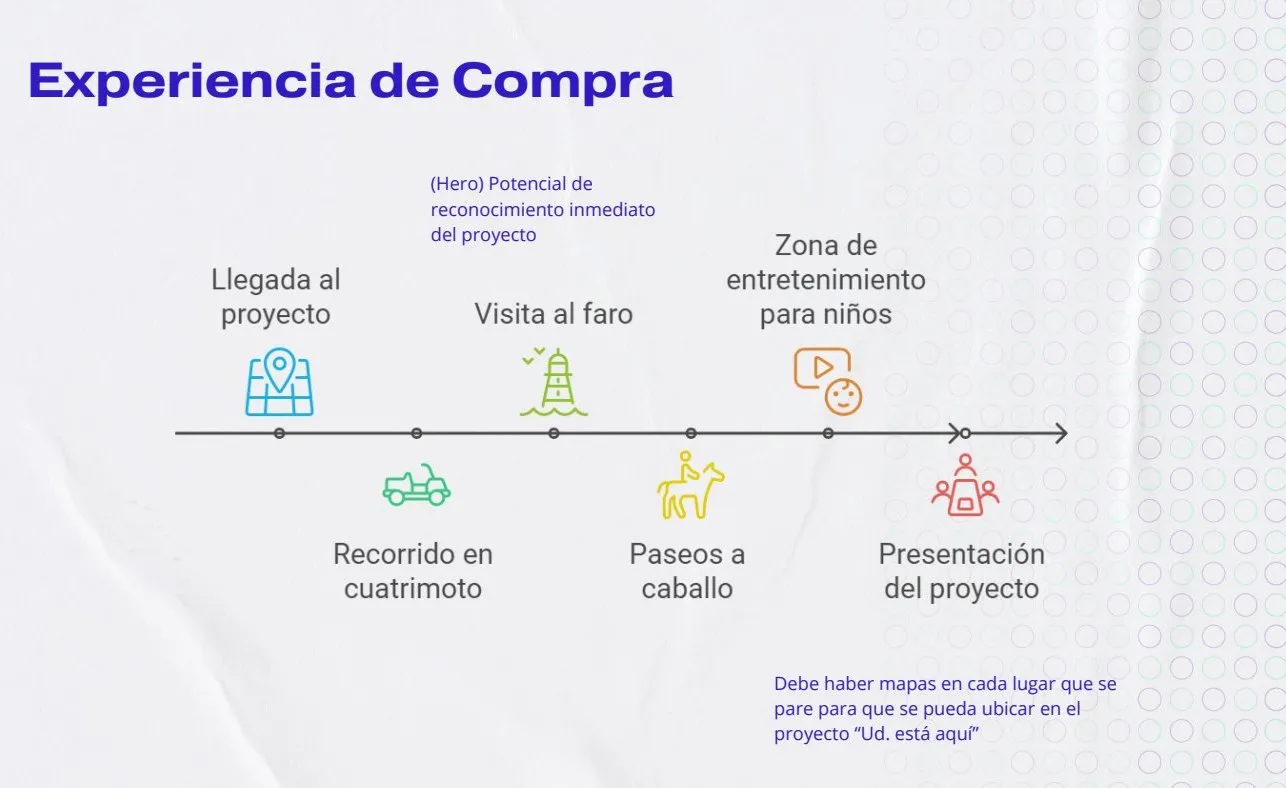
Since the project was just starting and trust was what mattered, we proposed that the sale be experienced on the land: an ATV tour of the superblocks, a visit to the lighthouse from the high ground, horseback rides, a kids' area and a close in a showroom.
The brand architecture
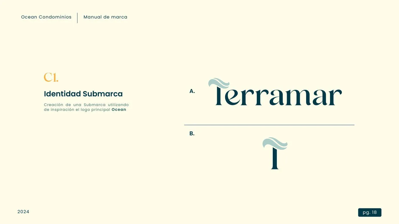
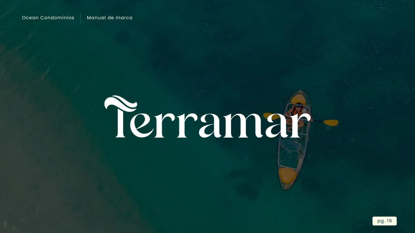
Three levels: Royal Ocean as the company, Ocean Condominios as the project and a sub-brand for each superblock, with names that evoke the sea. The first, with a sea view, was called Terramar, and was born from the same symbol as the parent brand.
The identity
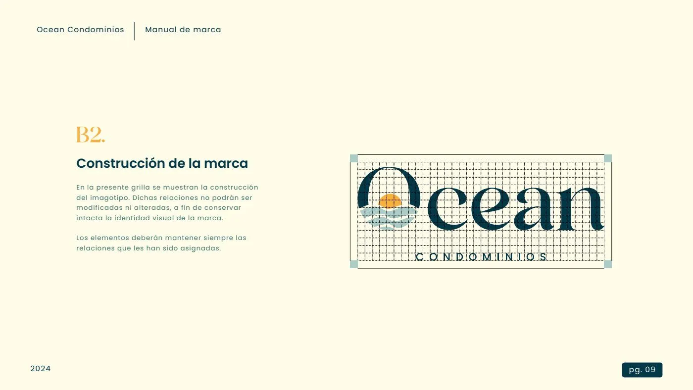
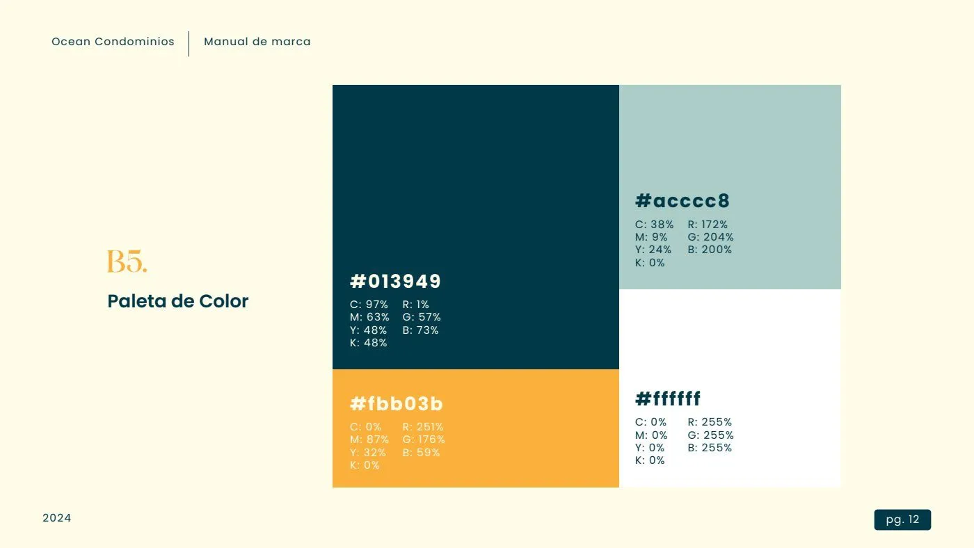
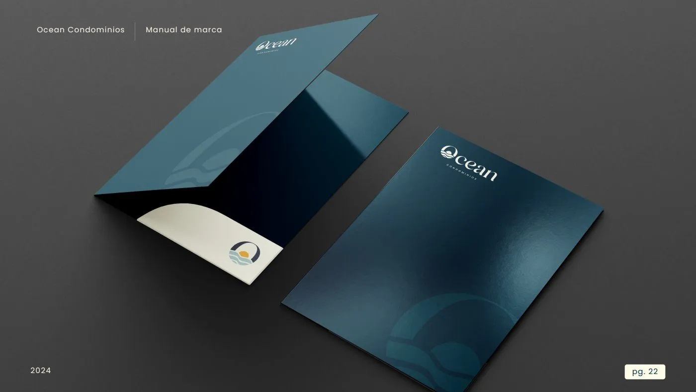
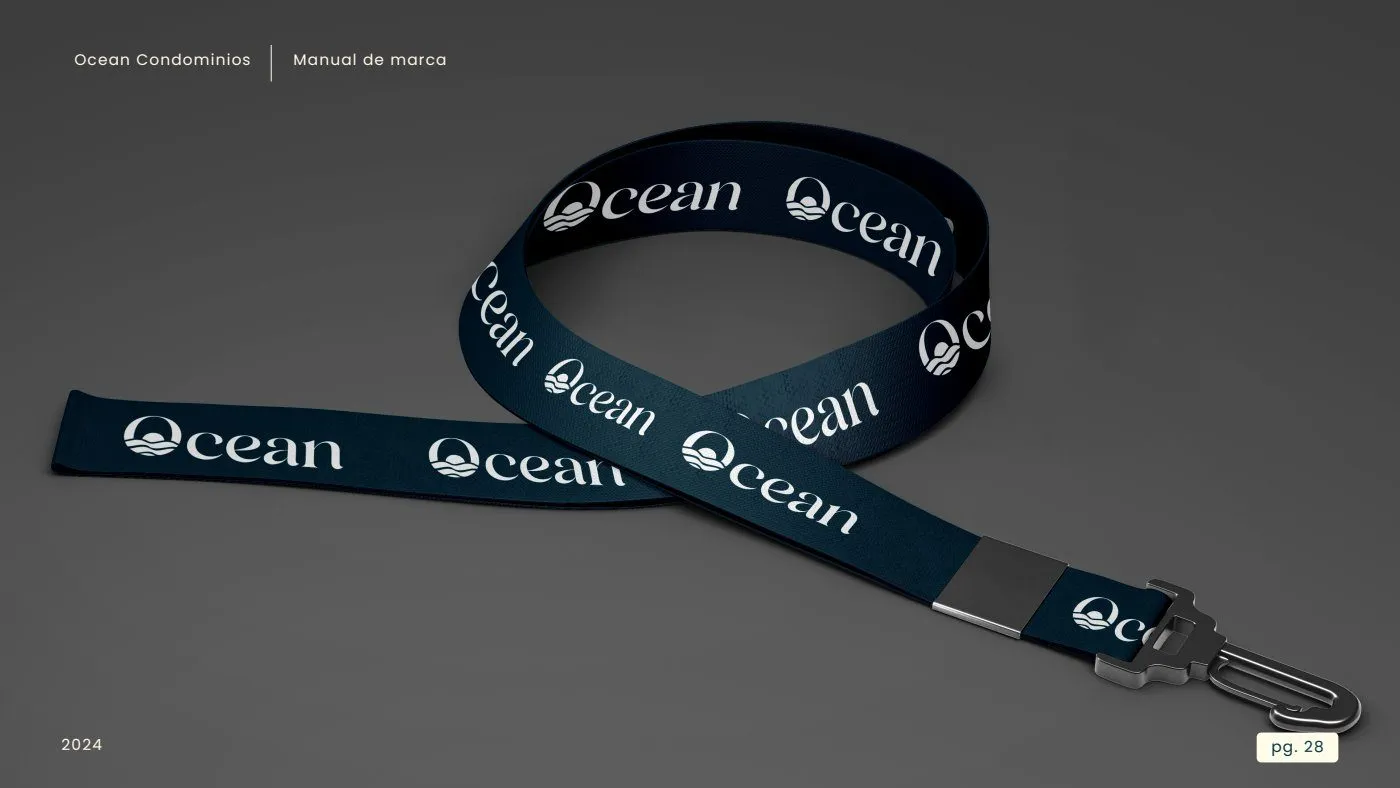
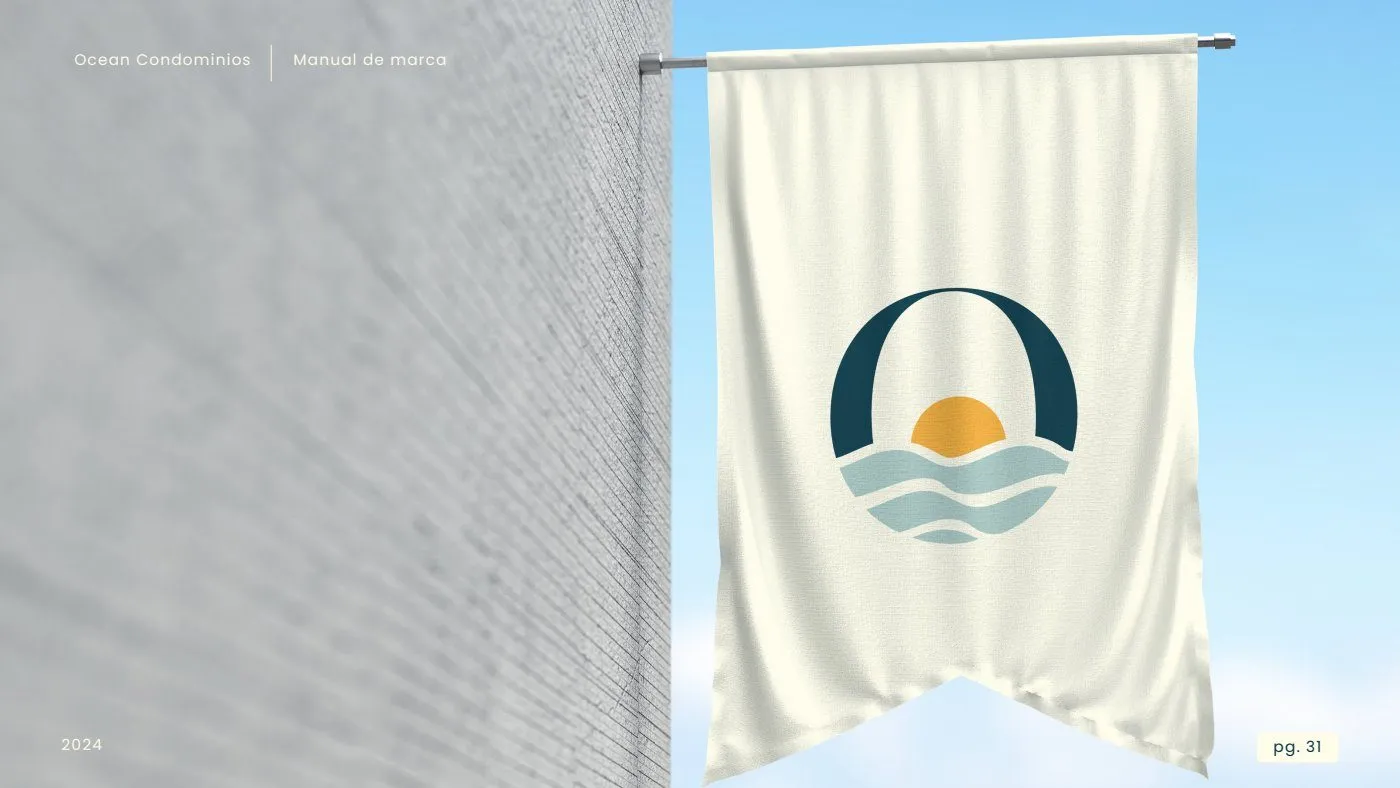
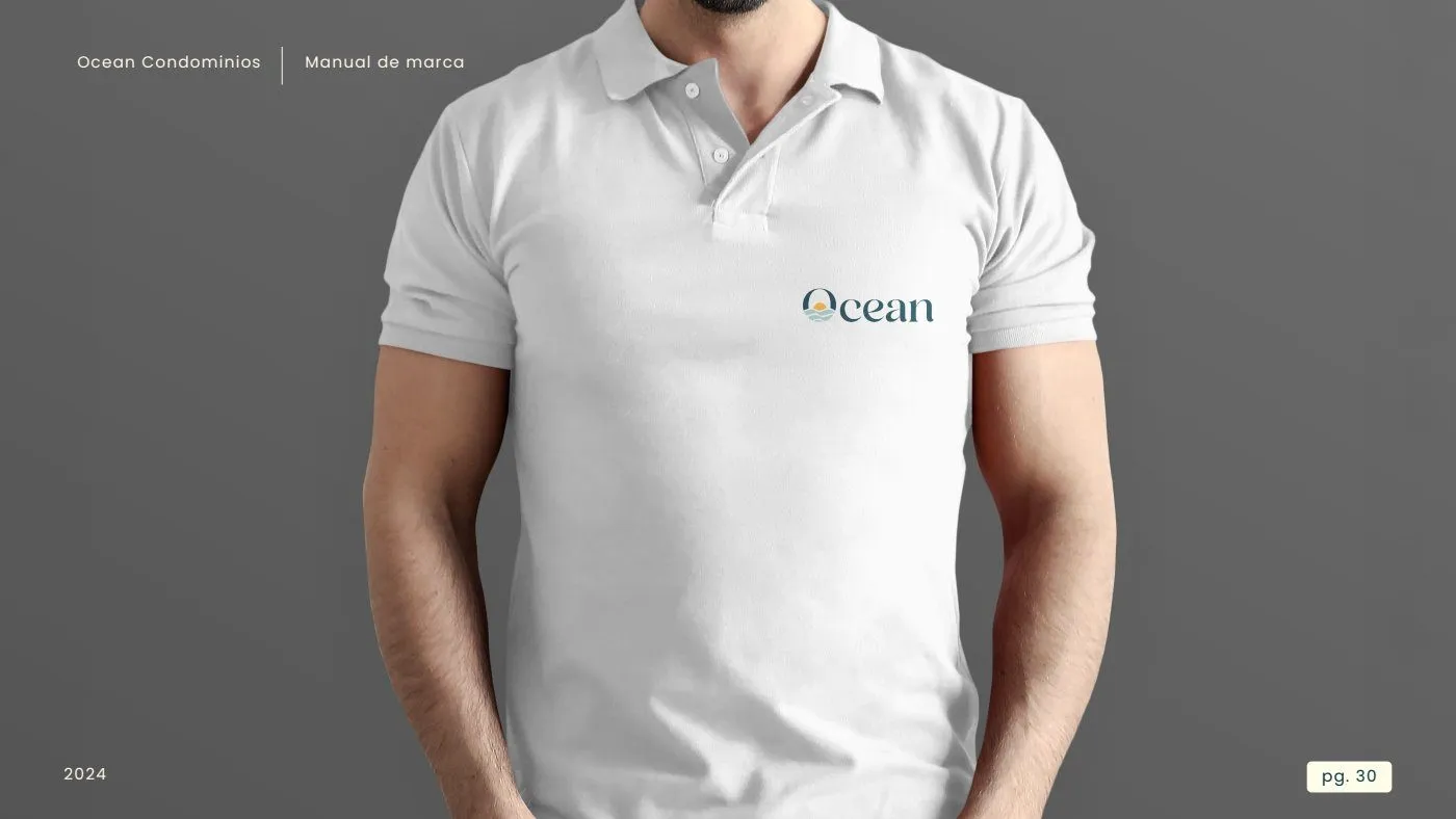
The O of Ocean is the symbol: a sun sinking between waves, inside an arch. A modern serif (Andora) for stability and durability, and Poppins for text. The palette comes from the landscape: deep petrol, aqua green, sunset yellow and white.
Applications
Result
The marketing plan and the brand were delivered. That's where the business relationship ended: the client continued the implementation with another provider.
Tell me about your project.
I answer every message personally. Leave your details in the form or write to me at:
yo@alejandroadriazola.com