Itzia
- Industry
- Construction
- Year
- 2024
- My role
- Account manager at the Liberte agency
- Disciplines
- Brand identity
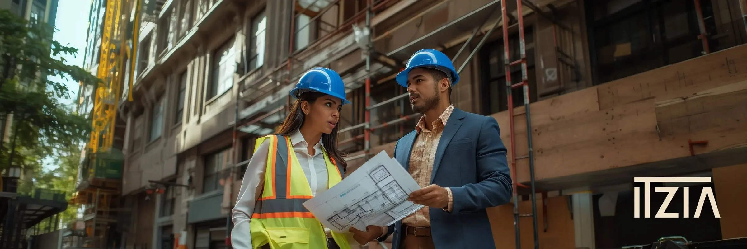
Identity for an Arequipa construction and real estate company that wanted to win its own clients.
My role
I was the account manager: I managed the account from start to finish. The logo was designed by the design team; I led the client meetings, presented the options and guided the conversation until they chose one.
The brief
Itzia built and remodeled for corporations and close clients. It wanted to make the leap into real estate: selling apartments to end buyers in Cayma and José Luis Bustamante y Rivero, and making sure that when it was hired for brokerage, people knew it also builds. It asked for a restyling and two new proposals.
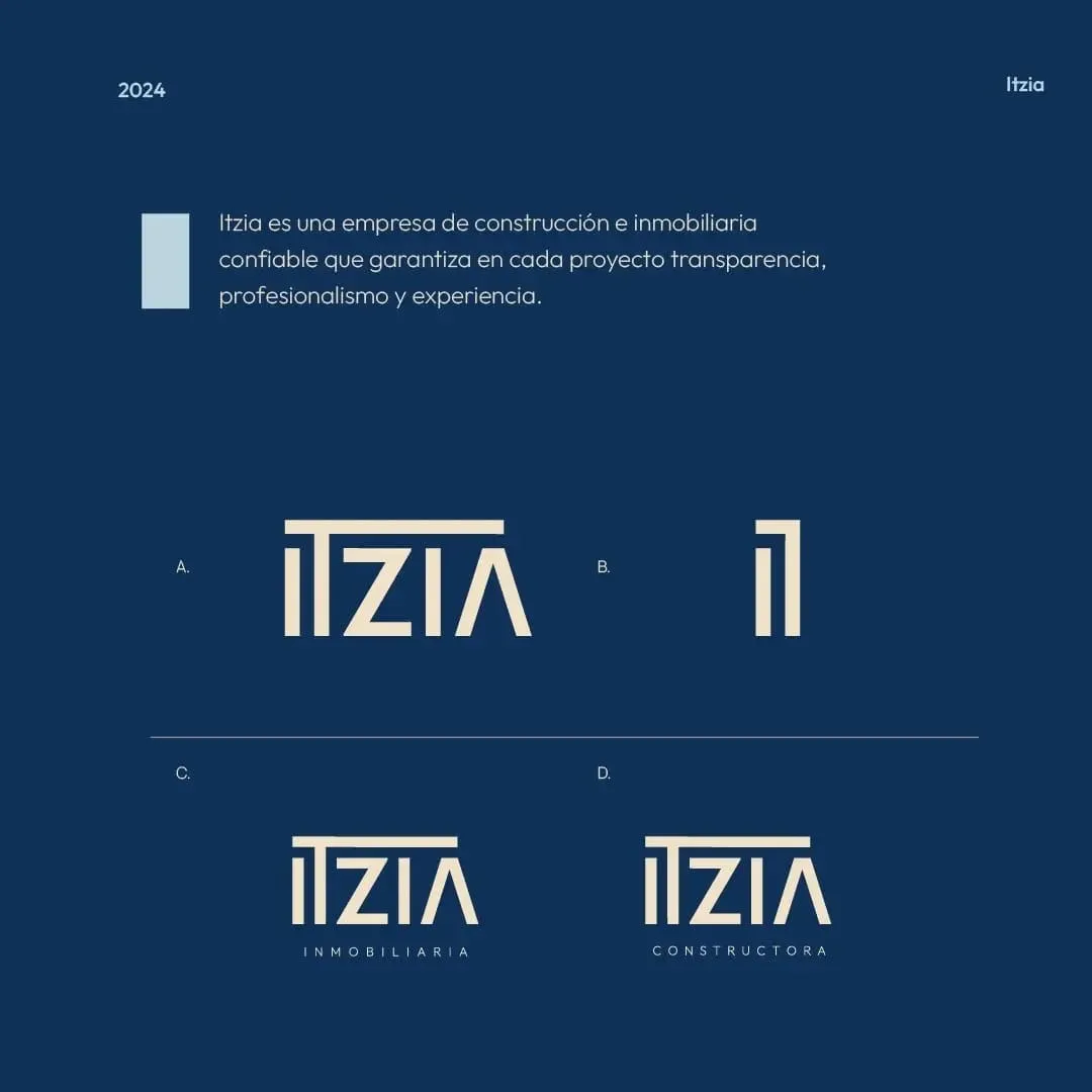
A brand that reads as structure: beam, columns and roof.
Building the brand
In the brief, Itzia described itself as a 35-year-old engineer, business casual, in khaki chinos and a blue shirt: someone who inspires trust without wearing a suit. From there came the DNA: the Sage archetype, a territory of transparency, professionalism and experience, and a single promise, all-inclusive quotes with no extras. We organized the brand as a branded house with two surnames, Constructora and Inmobiliaria.
The logo
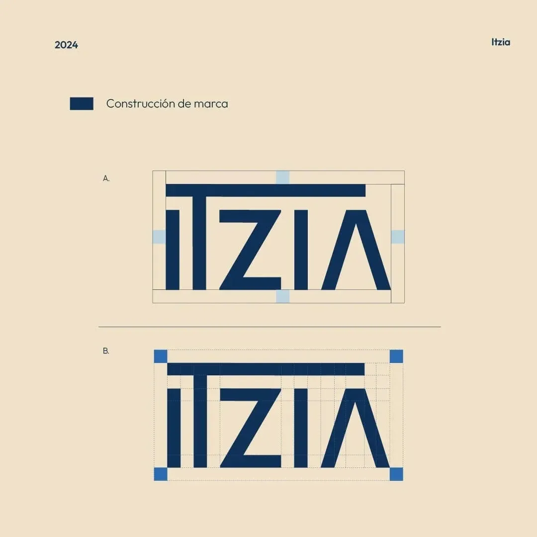
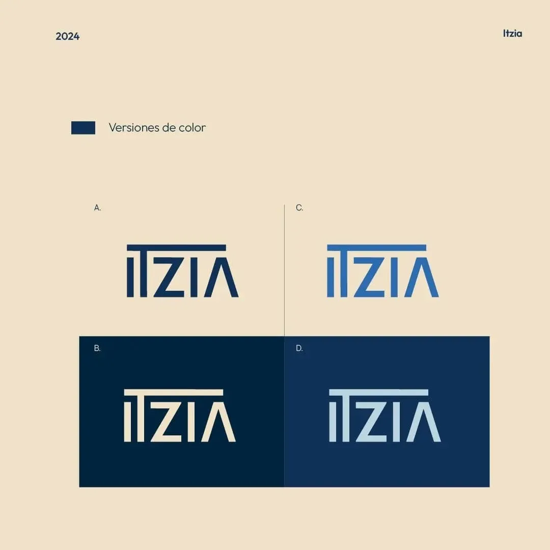
A typographic logo, with no separate symbol. The top bar joins the I and the T like a beam on columns, and the A without a crossbar works as a gabled roof. The geometry is straight with a uniform stroke, like a blueprint. The monogram comes from the same beam and serves small pieces.
Color
Navy blue as the base, for the seriousness and trust the brief asked for, and a warm cream instead of white, for the warmth the client named as its own. A medium blue is kept for accents. A short palette and lots of space: minimalism is what sets it apart from cluttered real estate brands.
Applications
Result
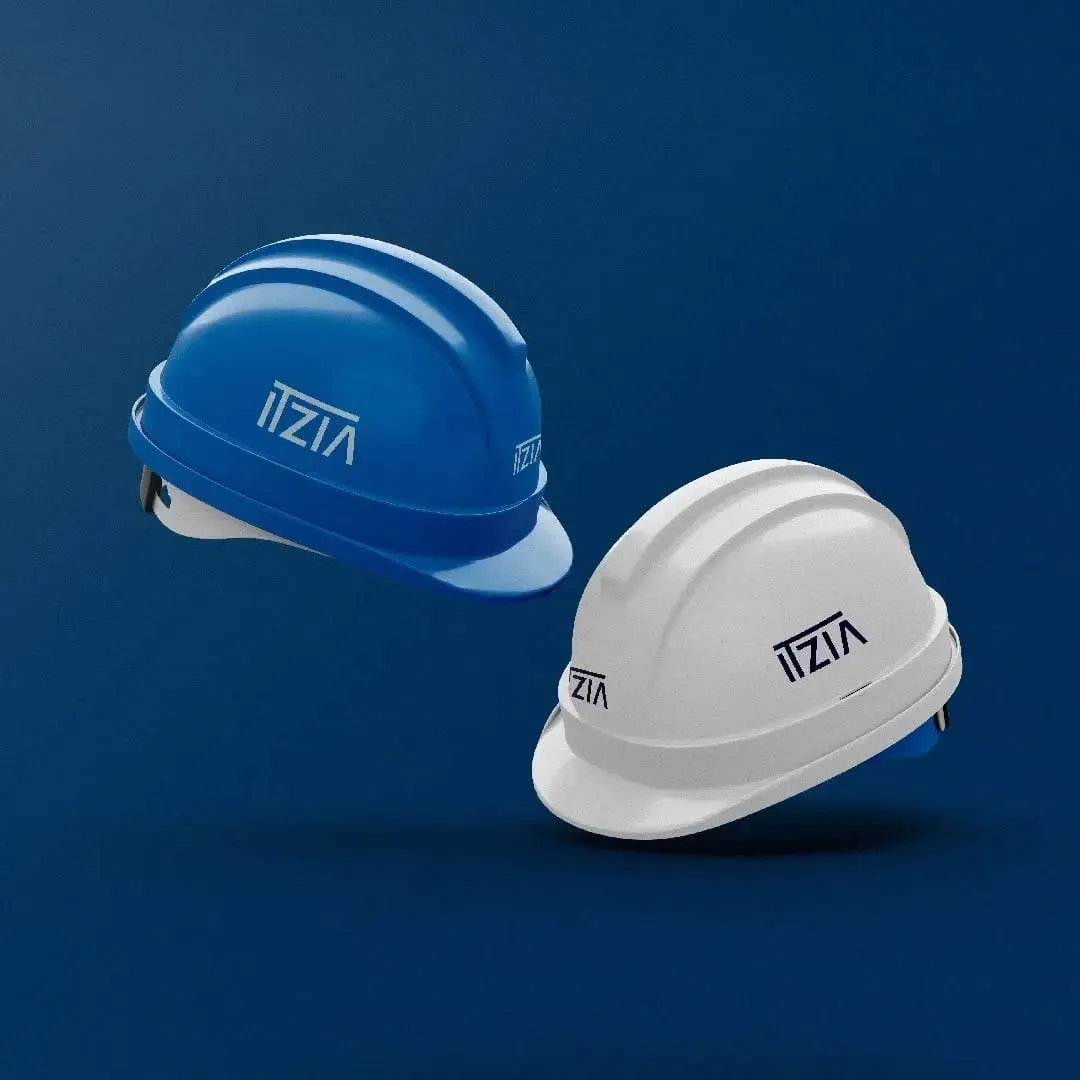
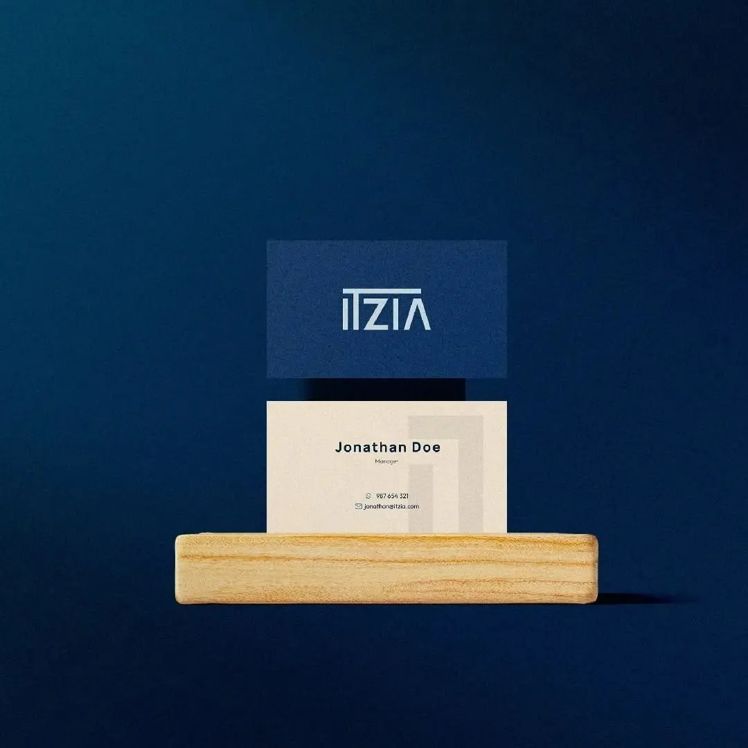
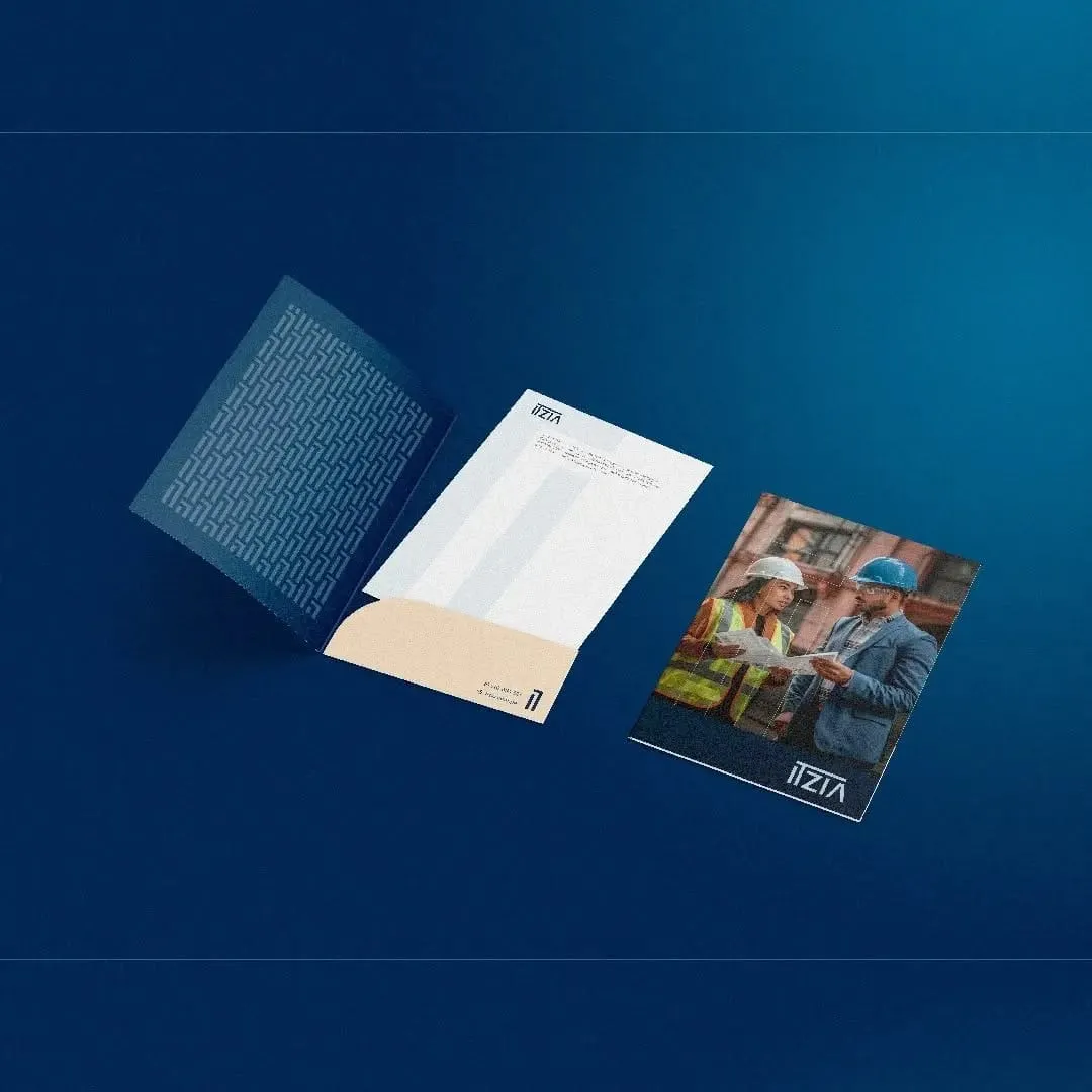
It was the chosen option. We got there by meeting with the client, presenting and adjusting with them, not through a single delivery. It closed with the brand manual and the applications: folder, letterhead, brochure cover, business cards and hard hat.
Tell me about your project.
I answer every message personally. Leave your details in the form or write to me at:
yo@alejandroadriazola.com