INDUMAD
- Industry
- Industrial
- Year
- 2025
- My role
- Design team management and brand design at the Liberte agency
- Disciplines
- Brand identity
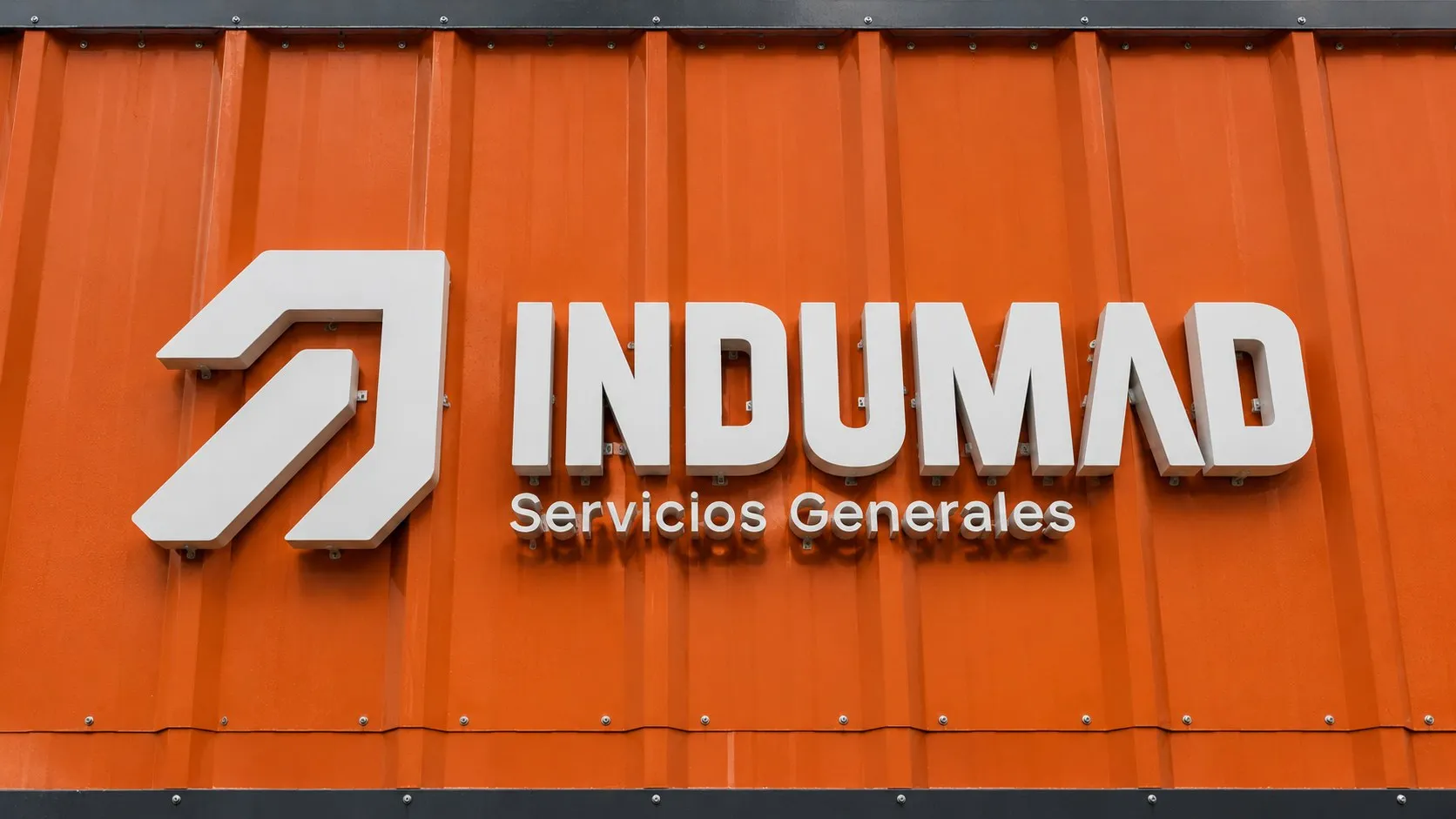
Identity for an Arequipa industrial and mining services company expanding into other markets.
My role
I managed the Liberte agency's design team to reach this identity. The designers proposed options, but the logo the client chose in the end was the one I designed.
The brief
INDUMAD has more than 20 years of service to industry and mining: container loading and unloading, staff outsourcing, cleaning of tanks and confined spaces, infrastructure maintenance and vehicle rental. It was expanding into other markets and wanted a brand that conveyed it. In the brief, the brand was a 30-year-old engineer in a mining uniform.
Integrated services in less time.
The idea
In the brand DNA we defined it with three words: strength, efficiency and trust. Its archetype is the Hero: a decisive brand that takes on complex challenges and comes through. On the perceptual map we placed it where high trust and fast response meet.
The logo
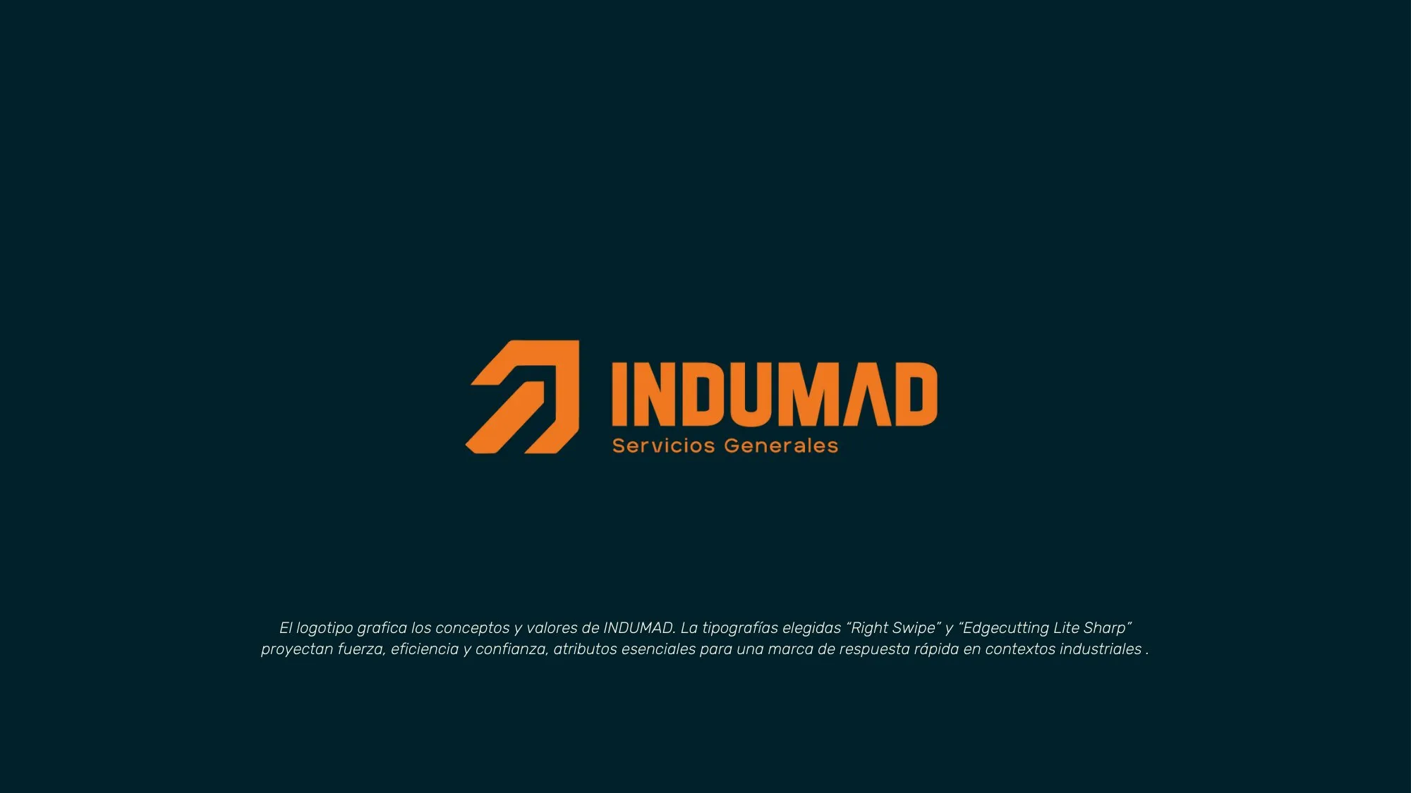
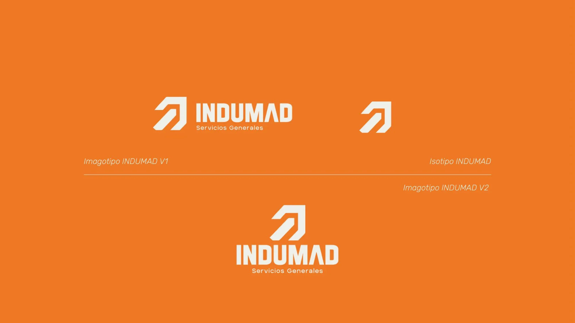
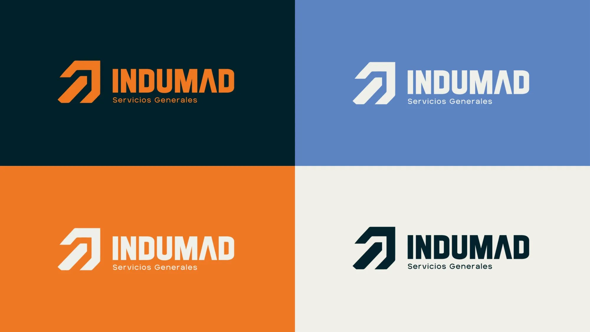
A symbol of diagonal strokes rising like an arrow and a name in a straight, condensed typeface: strength, efficiency and trust, what a fast-response brand needs in industrial settings. It has a horizontal and a vertical version.
Color and typography
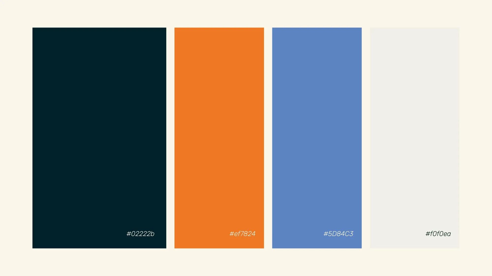
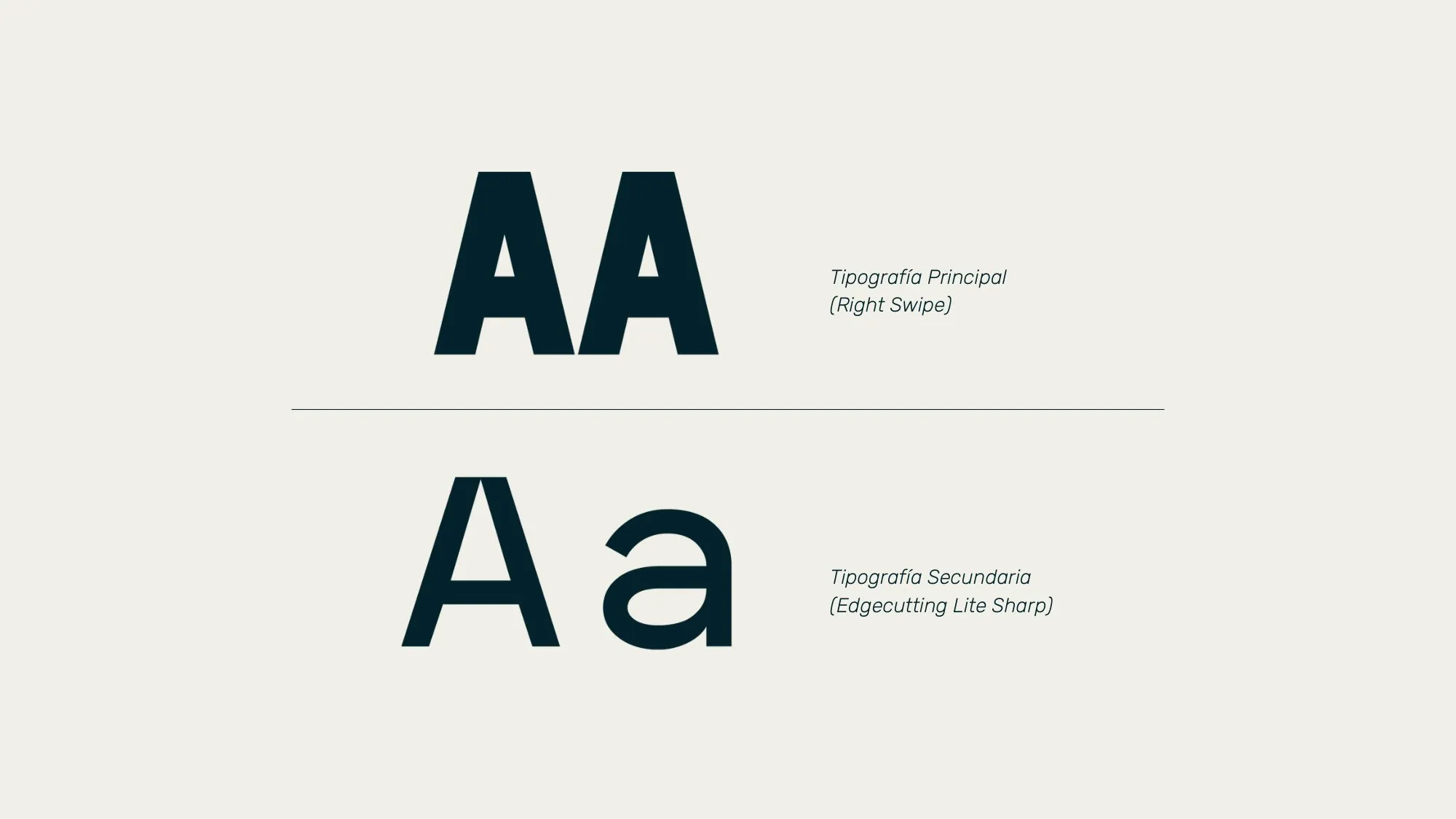
An almost-black petrol blue as the base, industrial safety orange as the accent and a medium blue as support. Two typefaces: Right Swipe for the name and Edgecutting Lite Sharp for text.
Uniforms
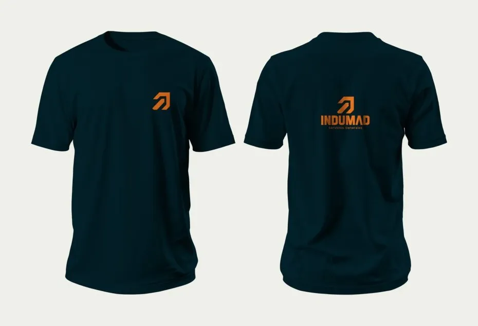
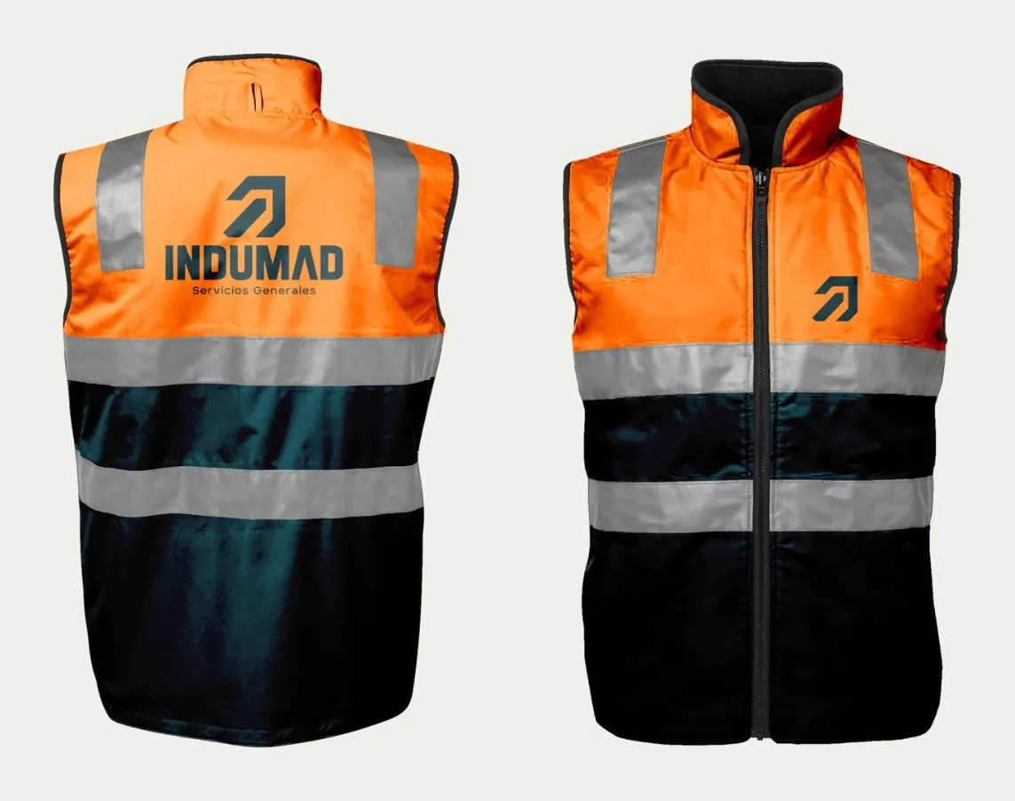
The applications the client requested, starting with the uniform: polo shirts and vests for field staff.
Stationery
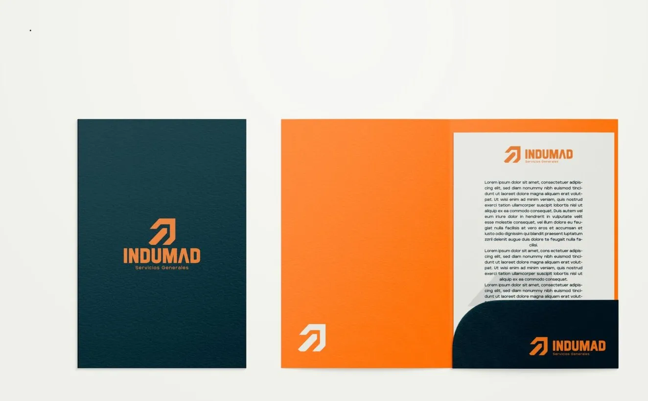
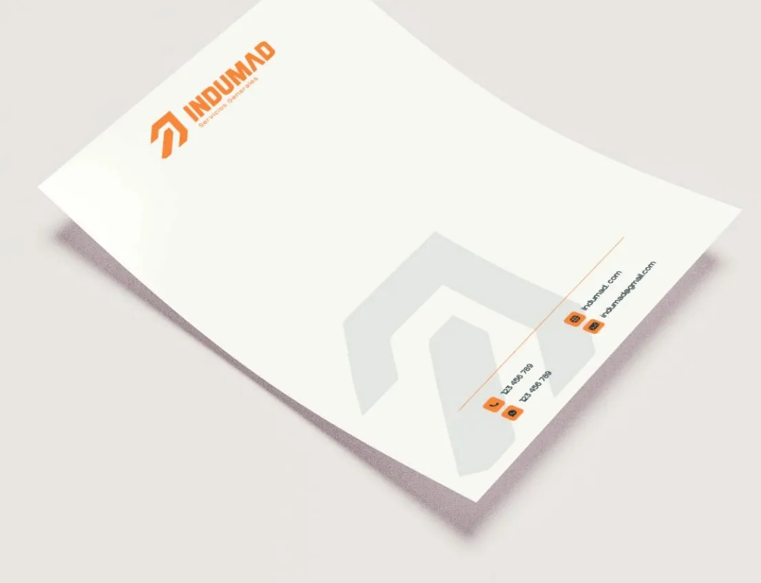
The folder and the letterhead.
Result
INDUMAD ended up with a complete identity, with its logo, colors, typefaces and applications, to present itself in new markets.
Tell me about your project.
I answer every message personally. Leave your details in the form or write to me at:
yo@alejandroadriazola.com