ECU
- Industry
- Industrial
- Year
- 2024
- My role
- Identity approval at the Liberte agency
- Disciplines
- Brand identity
The brand of a company owned by a community in Cusco that provides services to the mining industry.
My role
I worked with the agency's design team: the brand options went through my approval before reaching the client, and this is the one that stayed. The design and the client presentation were done by the designers.
The brief
ECU is the company of the Uchucarcco community in Cusco. It rents units to transport copper ore and yellow machinery, and does civil works for the local mining company. Its challenge was learning to be sustainable on its own, without depending only on that client. And the request was clear: the logo had to convey the community, not a truck.
The brand had to be the community, not a truck.
The DNA
In the brief, the community described itself as united people with strong character, with peasant patrols, camelid herding and a cheese plant, looking for hope of development. The brand was imagined as a mining engineer in her safety gear. From there came the DNA: the Hero archetype, the community's strength and determination to overcome challenges, across three territories: growth, prestige and community.
Where to place it
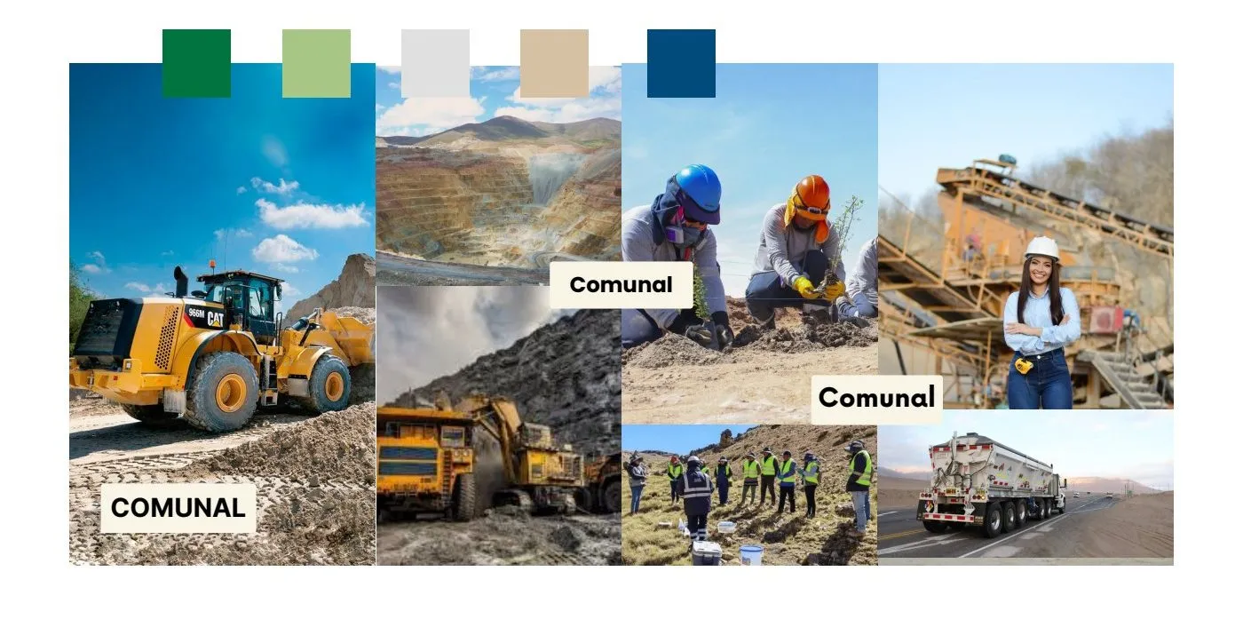
We reviewed the transport companies in the sector and the mining companies' brands. They all talked about trucks and corporate life. On the perceptual map we placed ECU where no one was: with the seriousness of a mining company, but with a community identity. The moodboard mixed machinery, Andean landscape and community members at work.
The logo
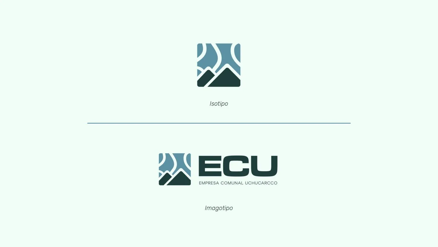
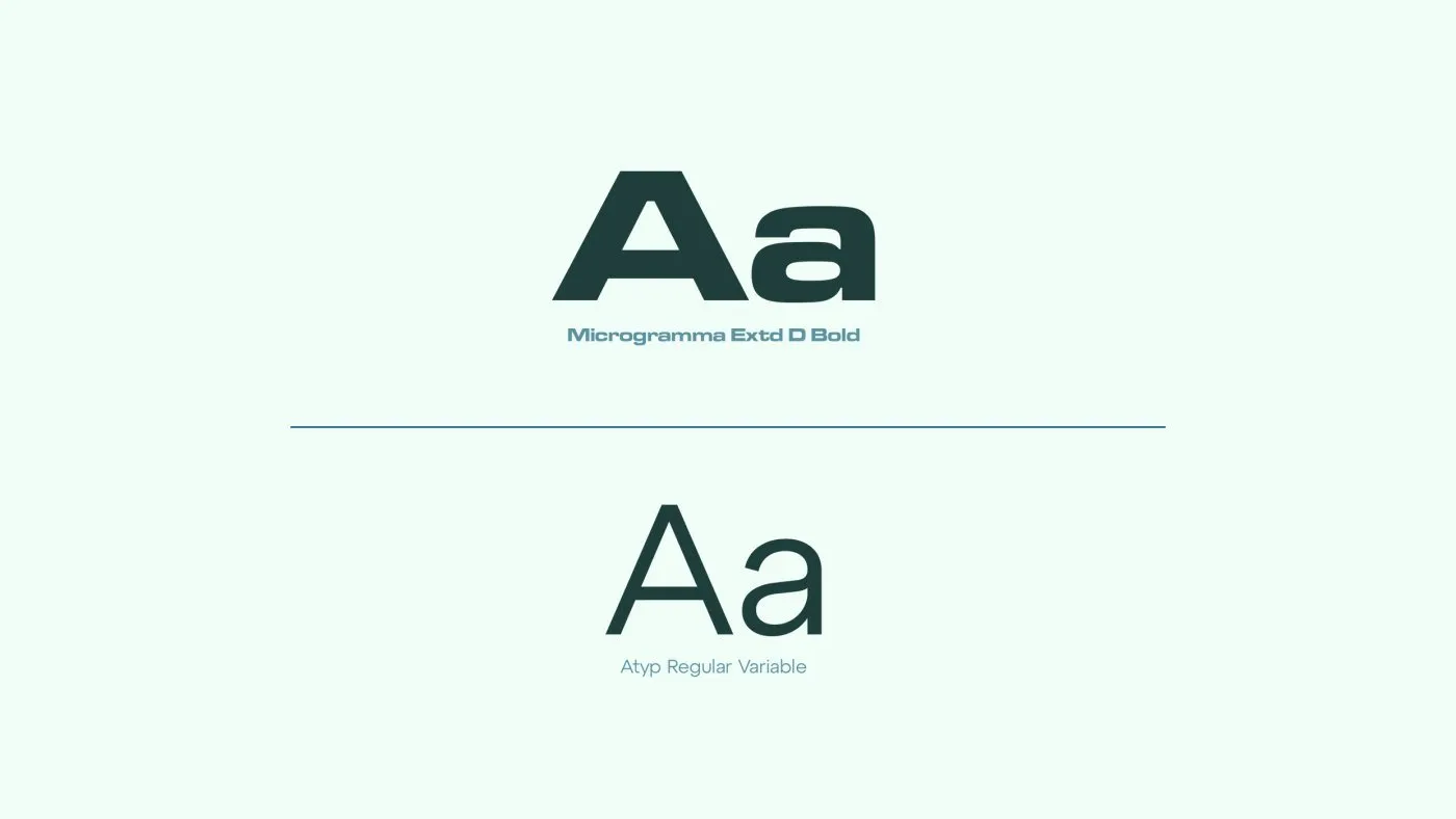
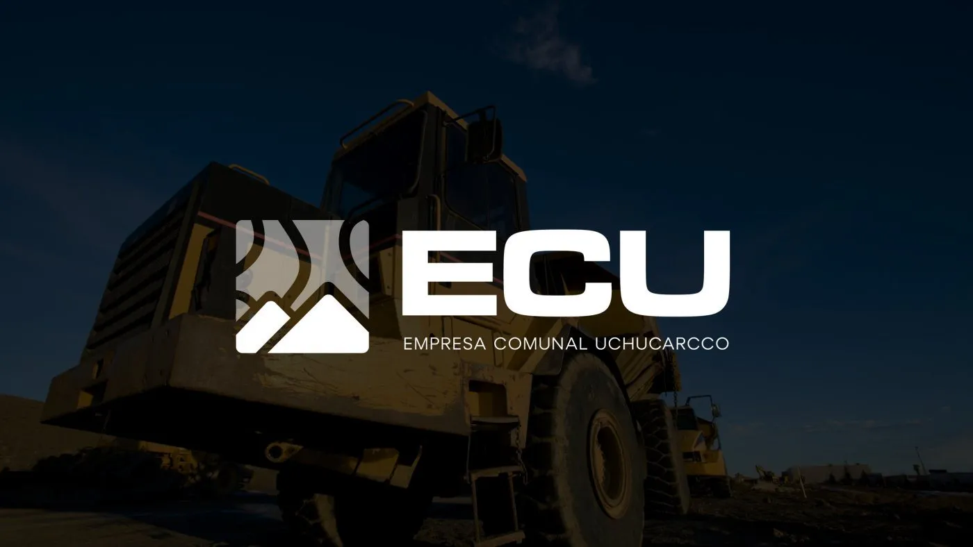
A framed symbol that evokes the land and hills of Uchucarcco, with no vehicle at all. ECU in extended capitals (Microgramma) for the solidity a mining company expects, and below, in full, Empresa Comunal Uchucarcco, so the collective side always reads.
Color and typography
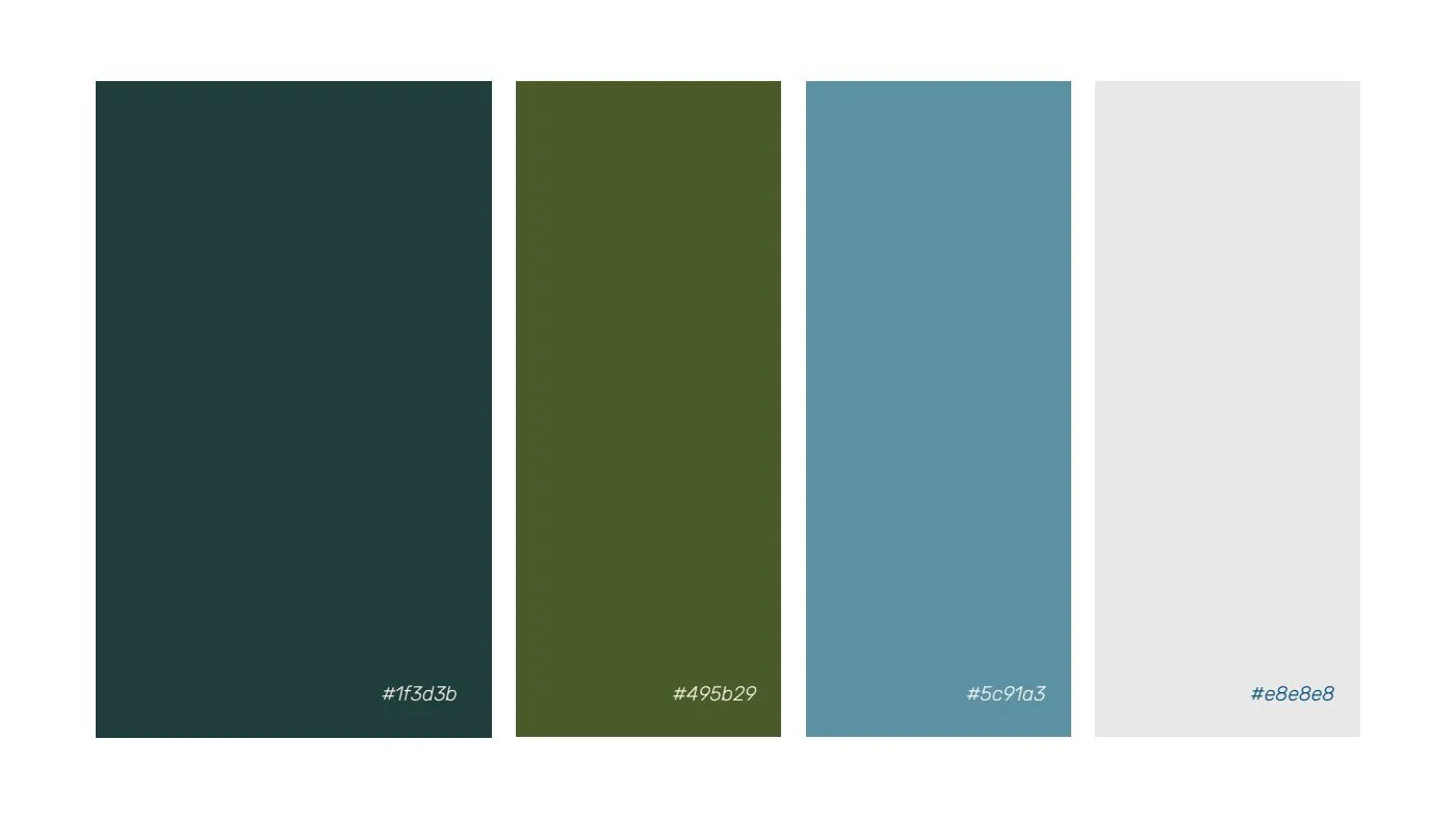
The palette comes from the Andean landscape: deep green, olive green, the blue of the high-altitude sky and a light gray. For text, a sober sans serif that supports the logo without competing.
Applications
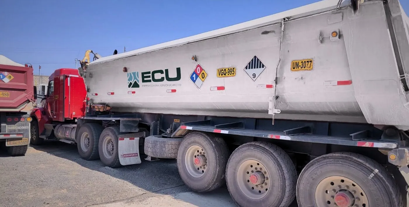
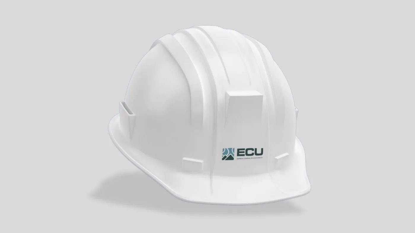
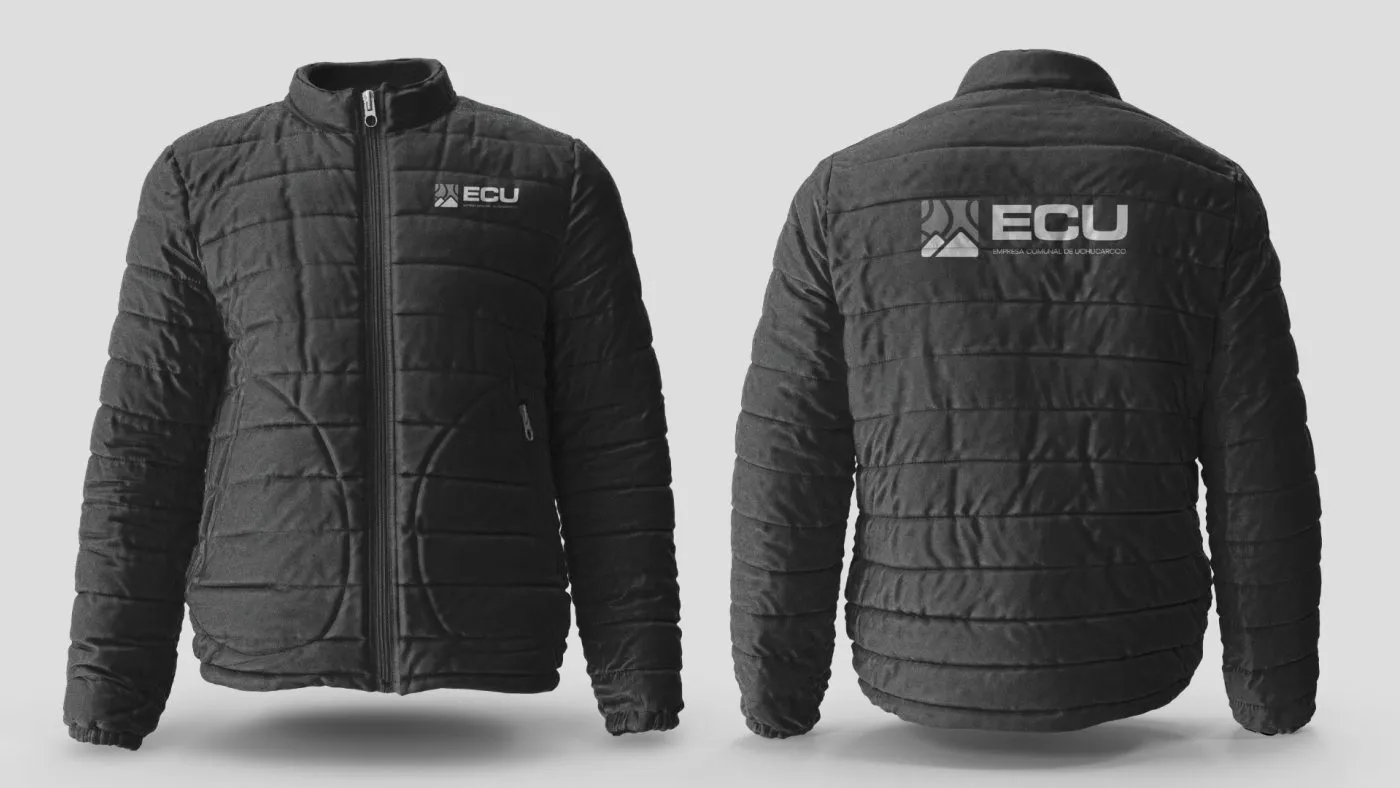
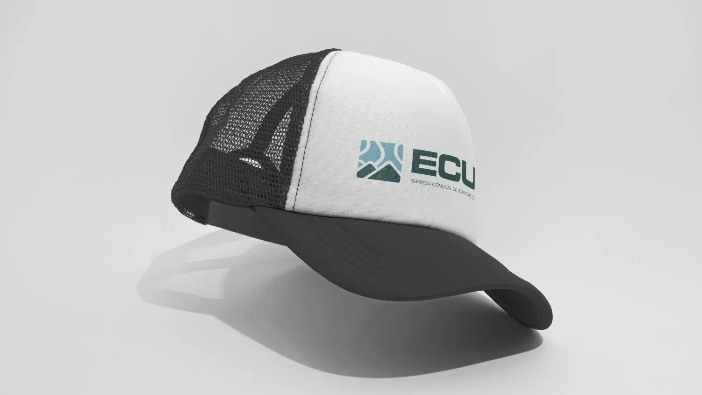
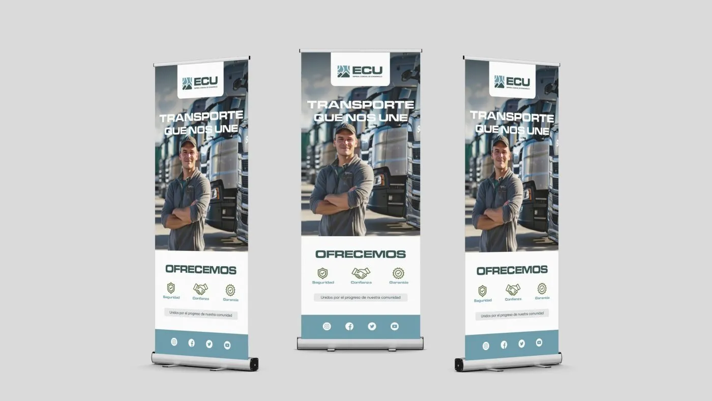
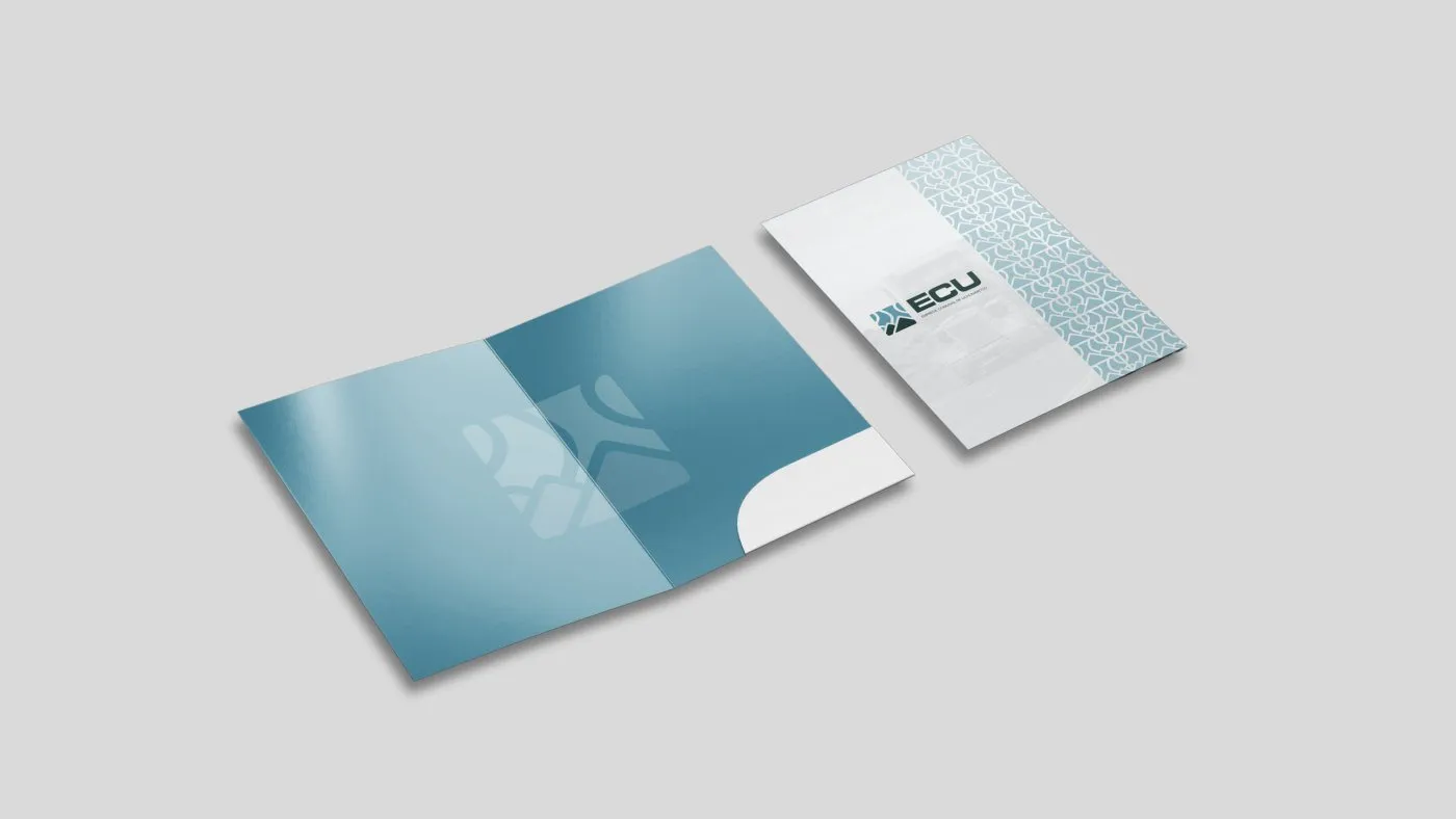
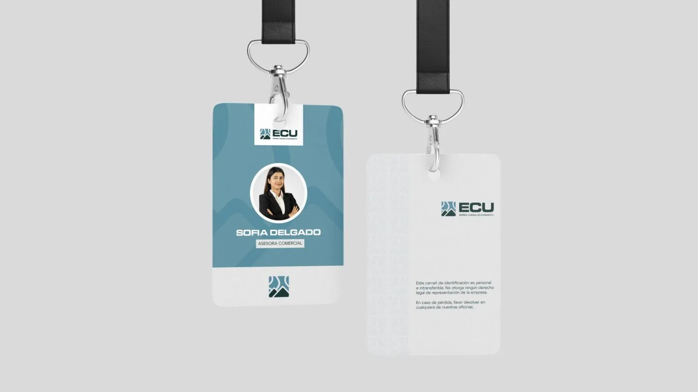
Twelve applications, from the site to the office: hard hat, jacket, polo shirt, cap, shirt, the trailer, stationery, email signature, folder, slides, banners and ID badge.
Result
A new identity that better represents the community and lets ECU compete on equal terms with other mining service companies.
Tell me about your project.
I answer every message personally. Leave your details in the form or write to me at:
yo@alejandroadriazola.com