Santa Cruz Abogados

- Industry
- Professional services
- Year
- 2025
- My role
- Design team management at the Liberte agency
- Disciplines
- Brand identity
Identity for an economic criminal law firm returning to the market as a boutique, without looking like a big corporation.
My role
I managed the Liberte agency's design team, from the brief to the final identity.
The brief
Santa Cruz is a specialized criminal law firm: economic and corporate criminal law, medical malpractice, money laundering and crimes against public administration. The lawyer's surname was already recognized, but the firm had been out of the market for four years. It was returning as a boutique firm, with direct attention and zero corruption, and didn't want to look like a big legal corporation or sound pompous: simple, but serious.
Simple, but serious.
The idea
The DNA came down to three words: trust, intelligence and prestige. The archetype is the Sage: technical mastery, maturity, international experience and a voice that puts judgment and truth first. The territory, a boutique, ethical and specialized firm, outside the traditional corporate model.
The logo
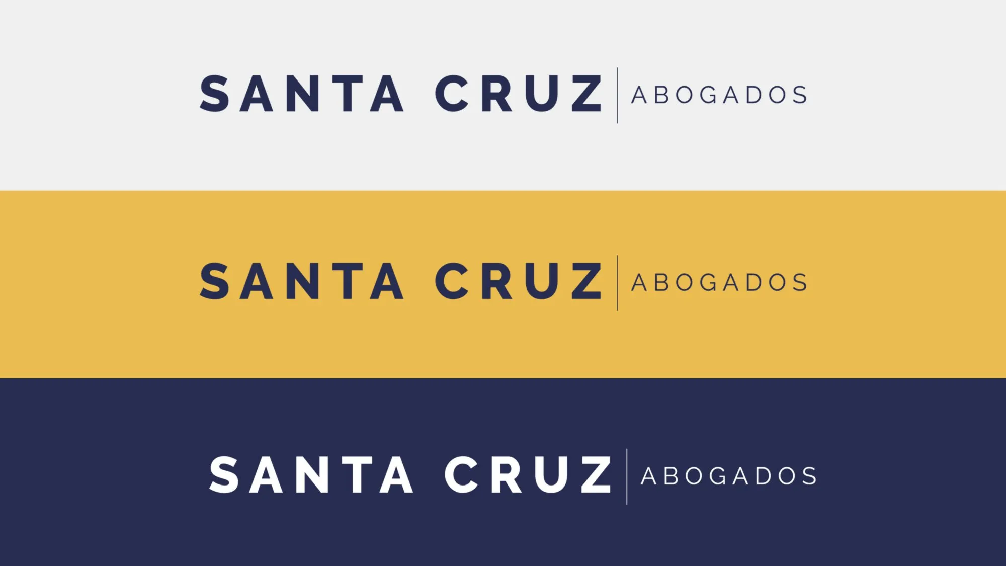
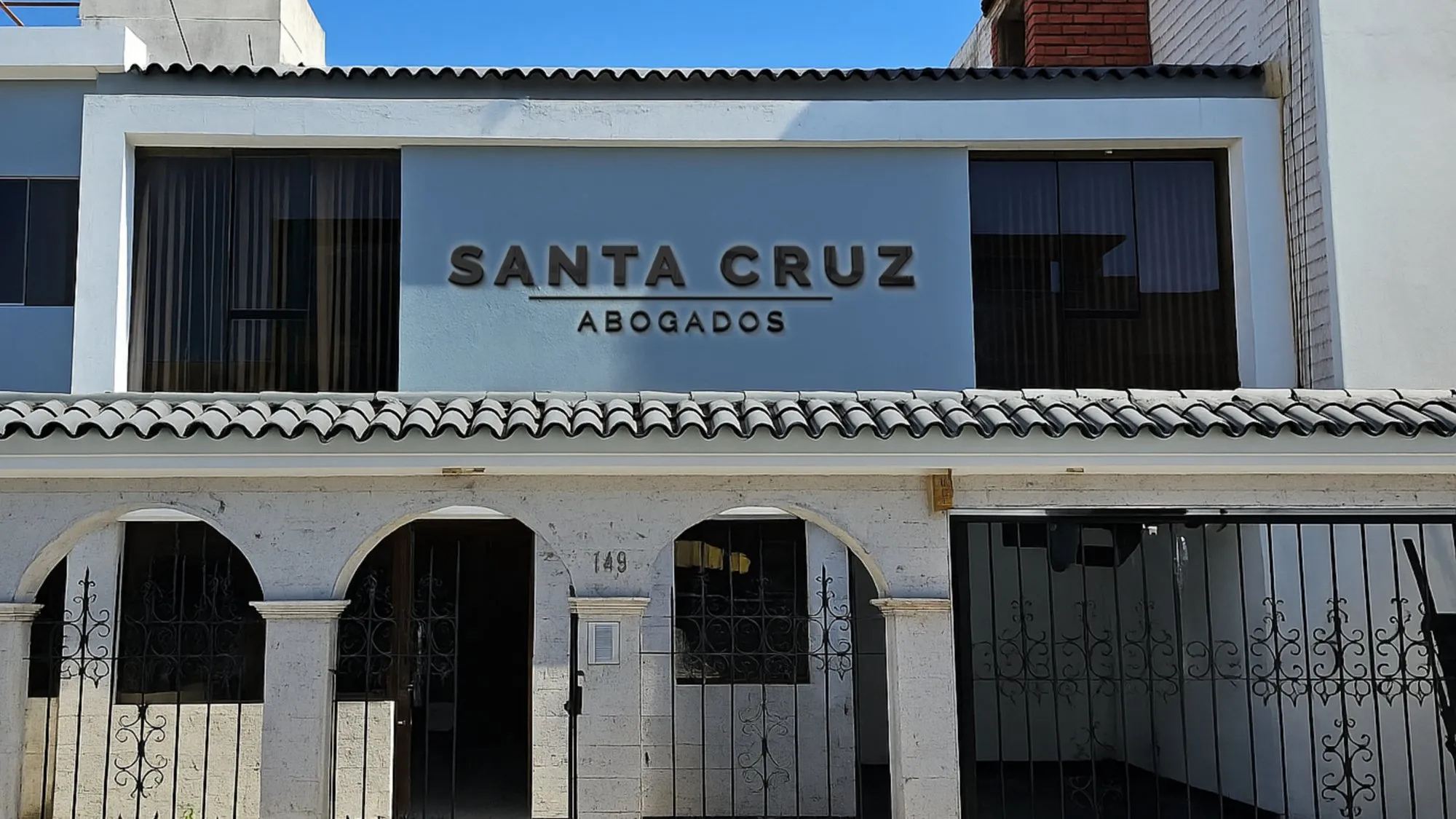
A typographic logo, with no symbol: the surname, which was already the brand, in spaced capitals, with abogados in a thinner line. Nothing to decorate; the seriousness lies in order and space.
Color and typography
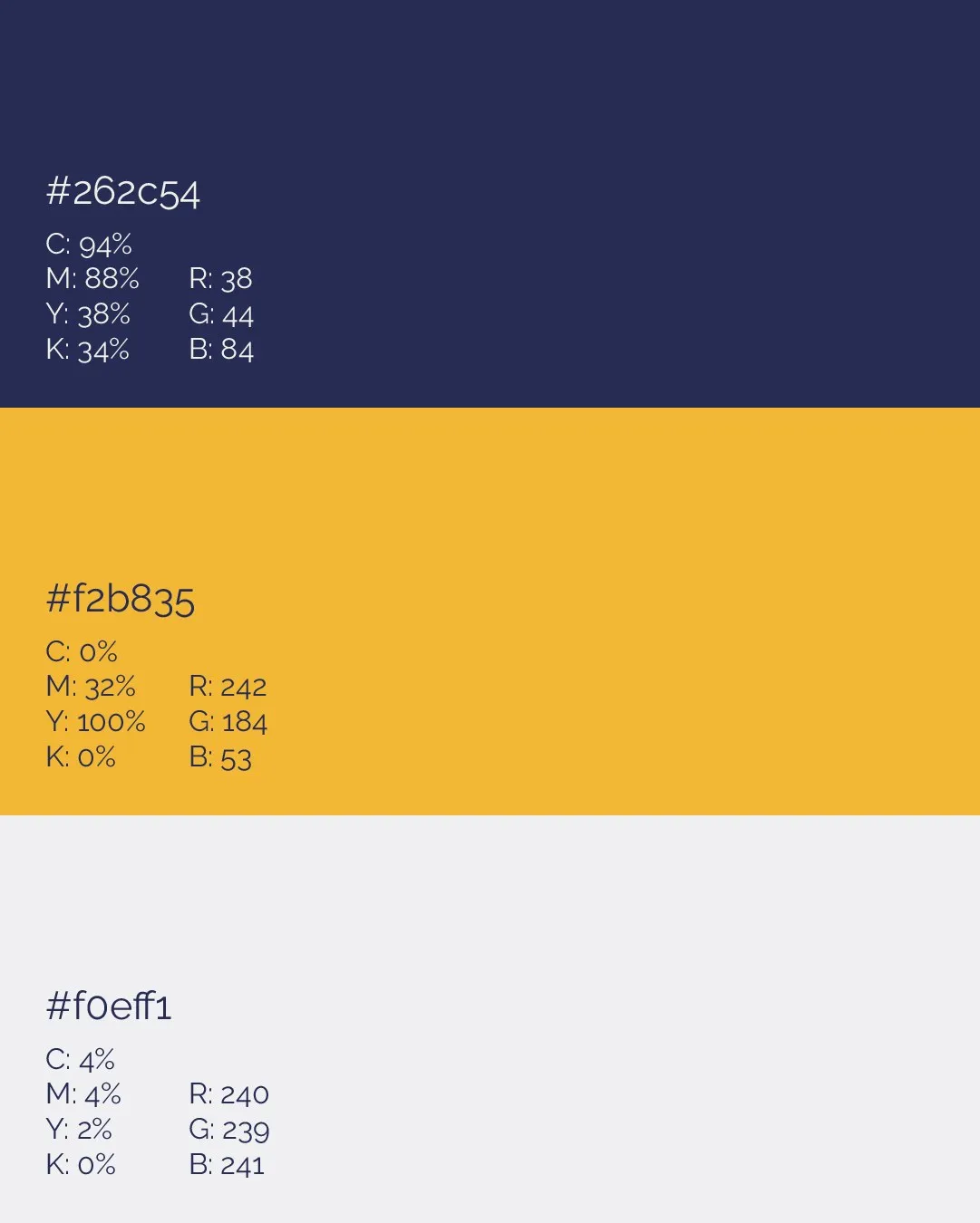
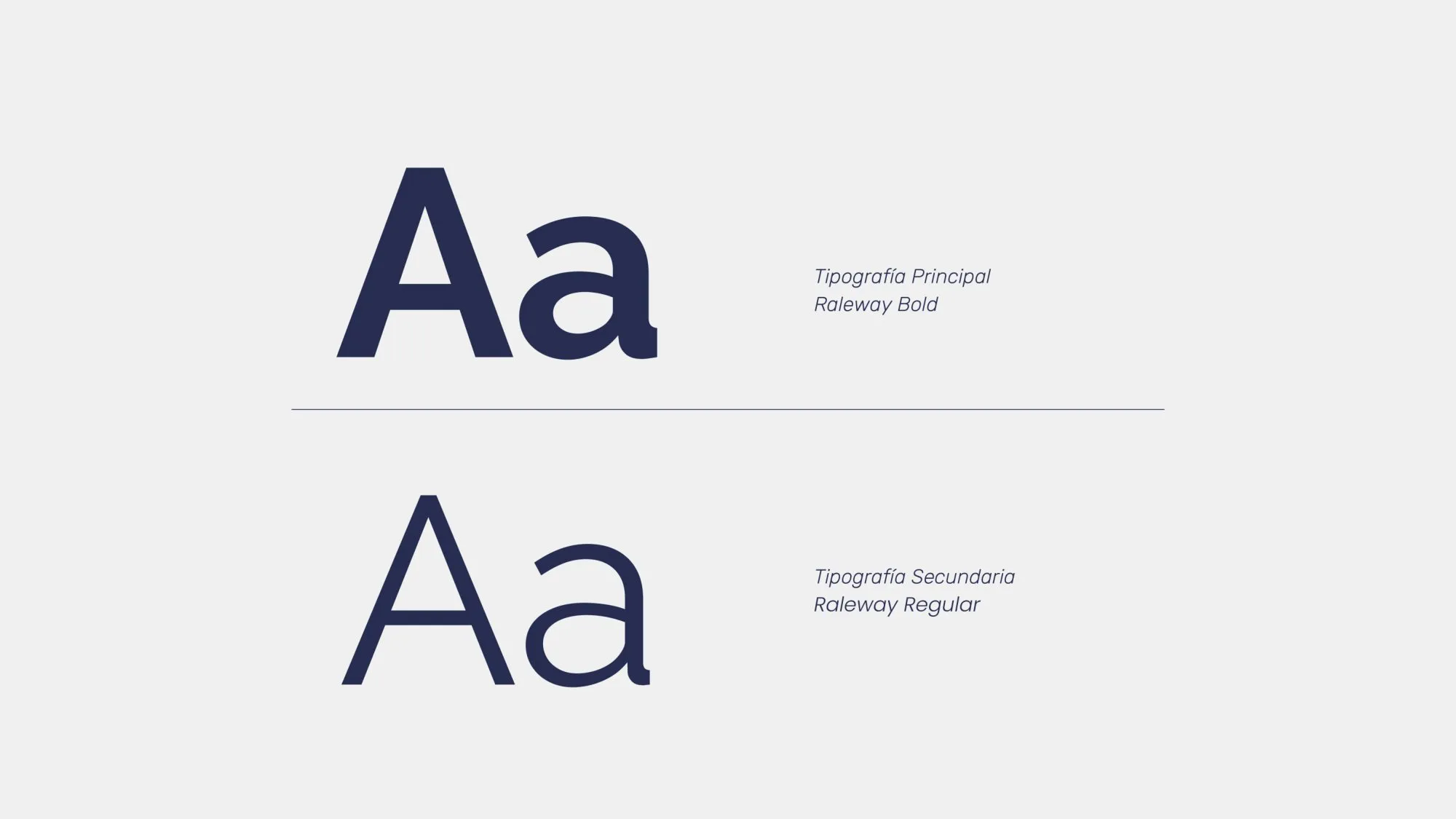
Navy blue for seriousness and trust, and a golden yellow that brings the summer and optimism the brief asked for, on a very light gray. The typeface is Raleway, bold for the name and regular for text.
Stationery
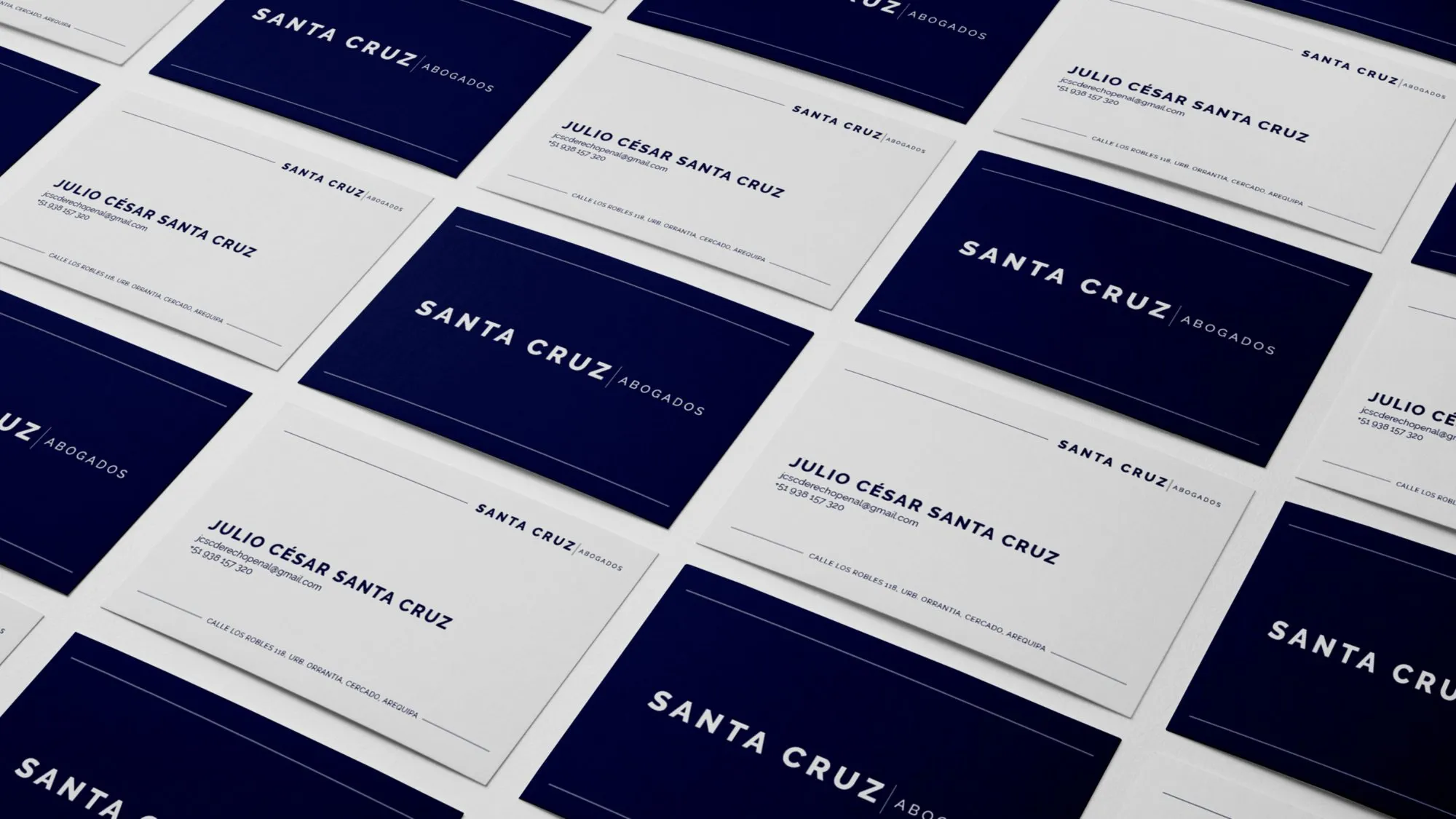
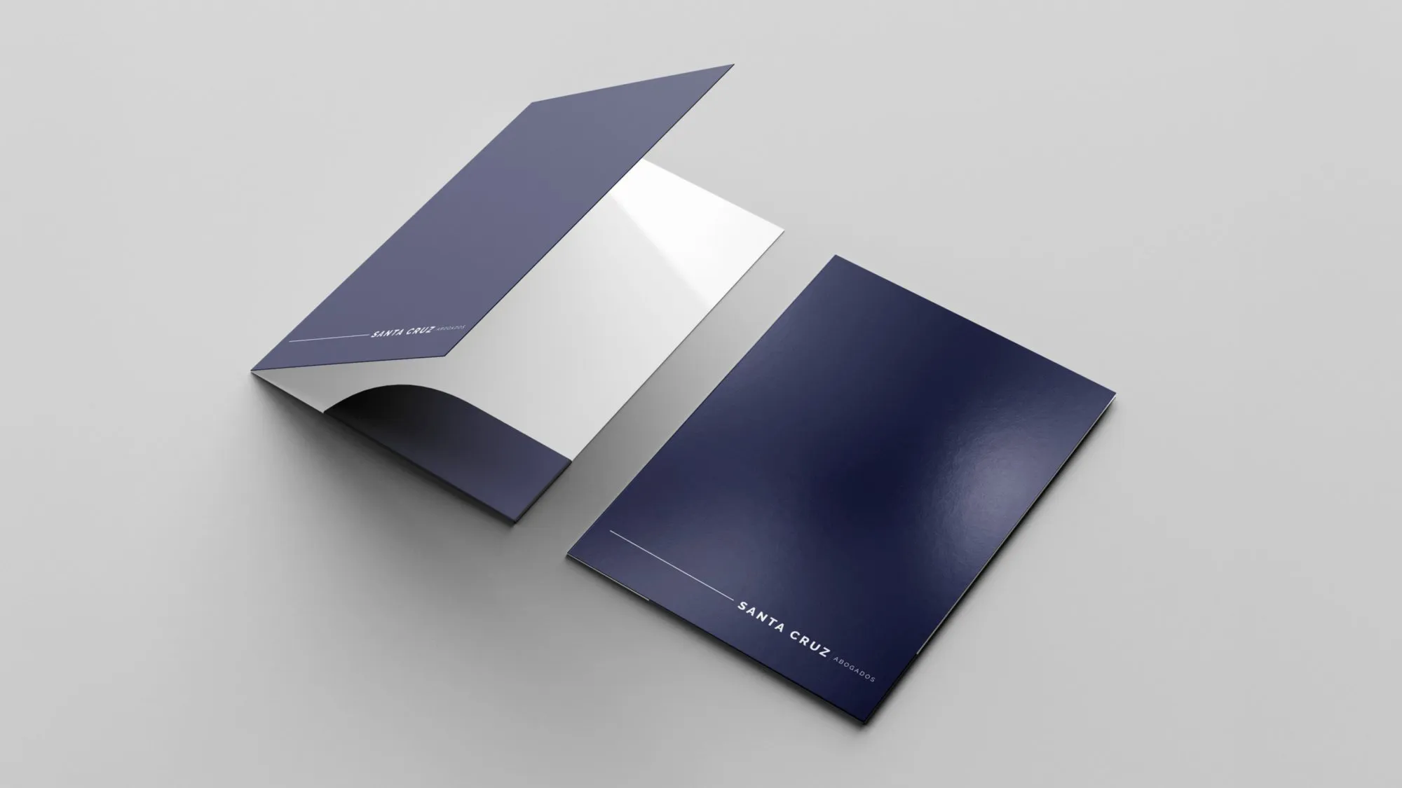
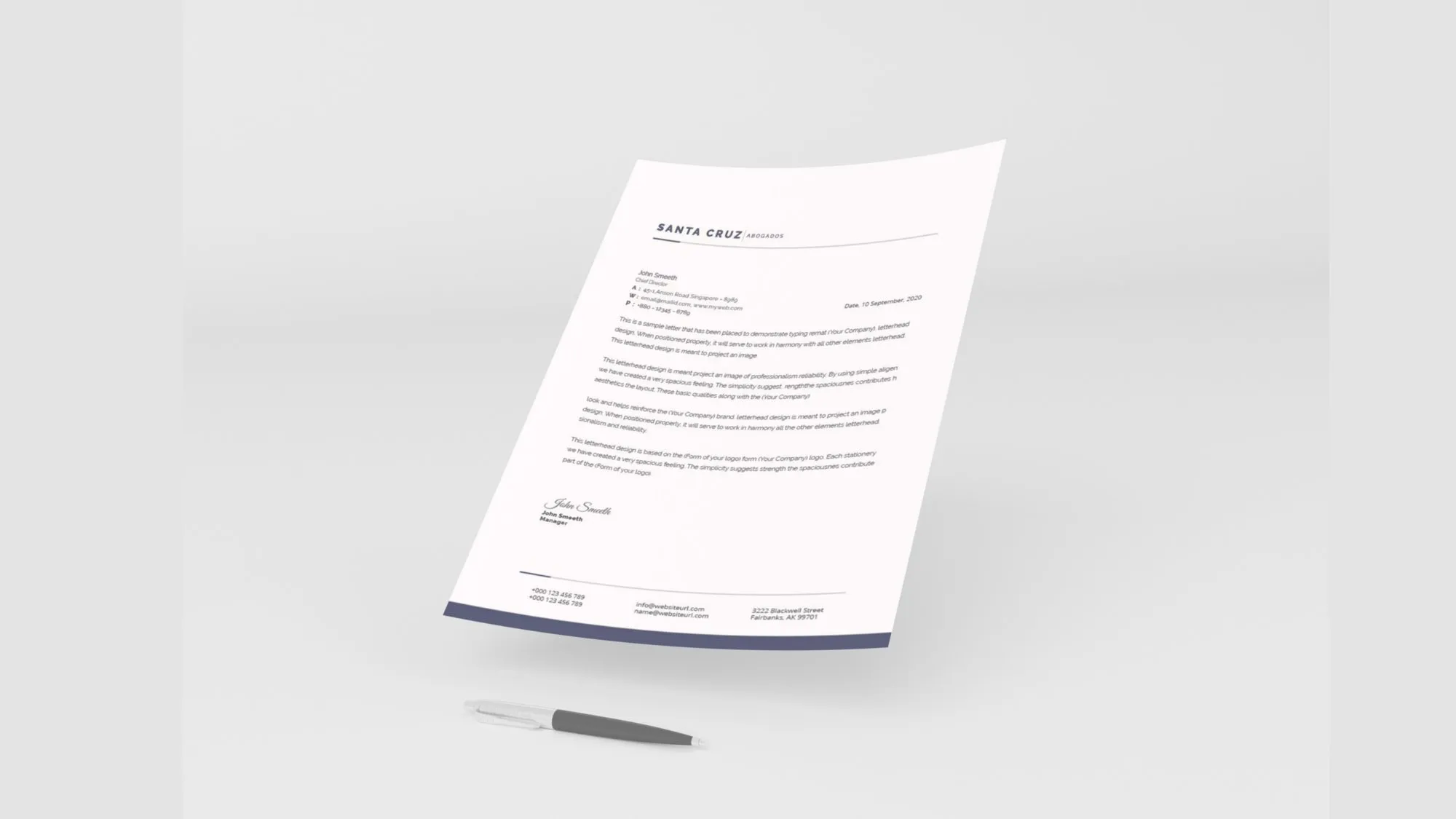
Business cards, folder and letterhead, in navy blue and white.
At the firm
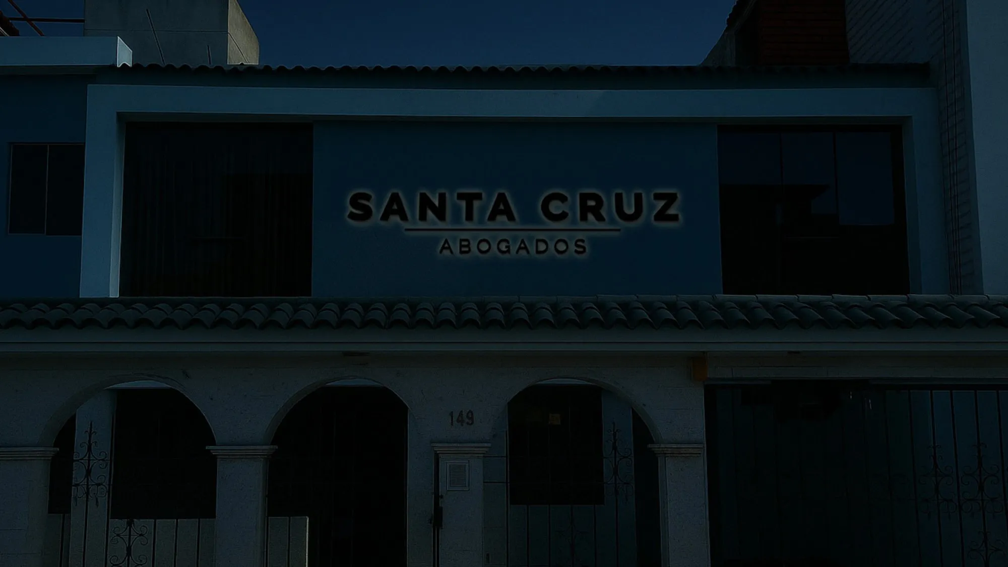
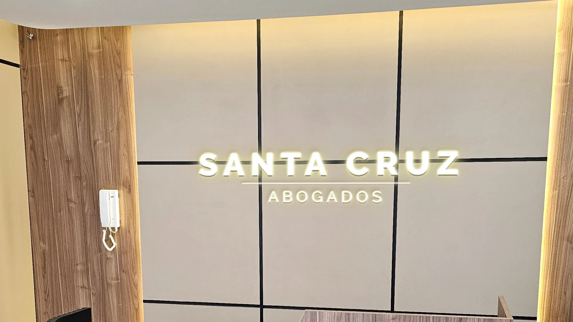
The brand on the facade, by day and by night, and at reception.
Result
Santa Cruz Abogados returned to the market with a sober identity of its own, which builds on the recognition of its surname and runs from the business card to the firm's facade.
Tell me about your project.
I answer every message personally. Leave your details in the form or write to me at:
yo@alejandroadriazola.com