- Industry
- Food and beverage
- Year
- 2023
- My role
- Identity project lead; author of the chosen option
- Disciplines
- Brand identity, Web and UX
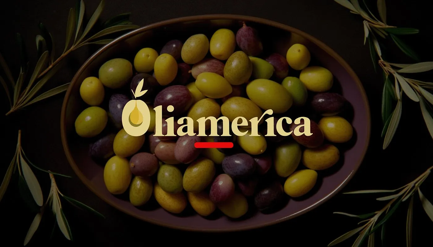
The new identity of an olive processor from Tacna that wanted to sell to European and Brazilian importers.
My role
I led the identity project. We split the options with the agency's designers, and mine was chosen: I made it in 2023, when we were already working with AI. Then came the client's feedback, which one of the designers refined.
The brief
Oliamérica processes green and black table olives and olive oil in Tacna. It wanted to export in bulk to Europe and Brazil and become known as a company, not just a supplier. It asked for three proposals: a restyling of its logo at the time and two new brands.
Peruvian olives, ripened on the tree.
The brief, in depth
Its reason for being was to stand apart from Chilean olives: the black olive that ripens on the tree is better than one ripened artificially. They wanted to reclaim the Peruvian origin and speak to Italian and Brazilian importers. The brand was imagined as a 30-year-old food engineer in boots, jeans, a white blouse and a wide-brimmed hat: someone who takes the field to the table. An olive grove, a tigress, a Peruvian waltz.
The logo
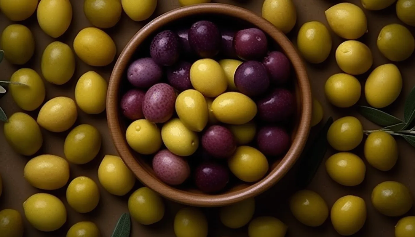
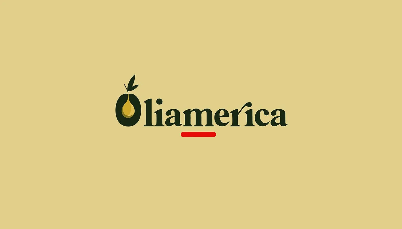
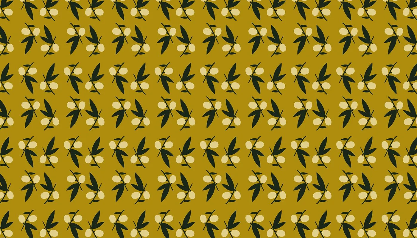
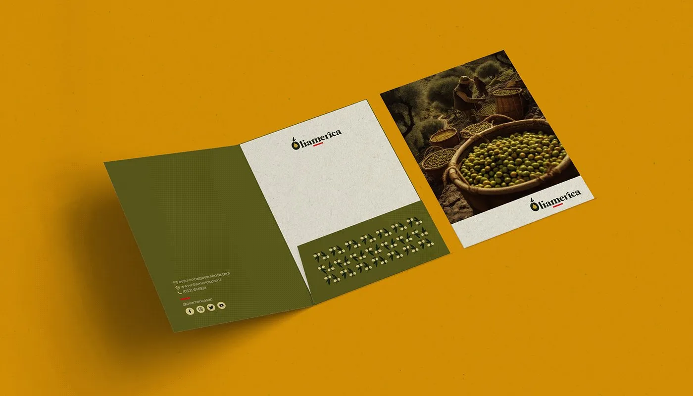
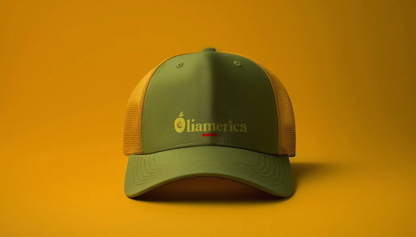
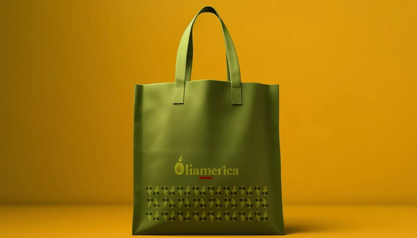
The O is the olive: it holds a drop of oil inside and its leafy branch on top. The name is set in a warm serif, with a red underline that recalls the Peruvian origin. The pattern repeats the olive with its leaves for packaging and stationery.
Color and typography
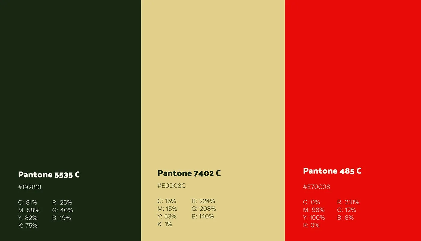
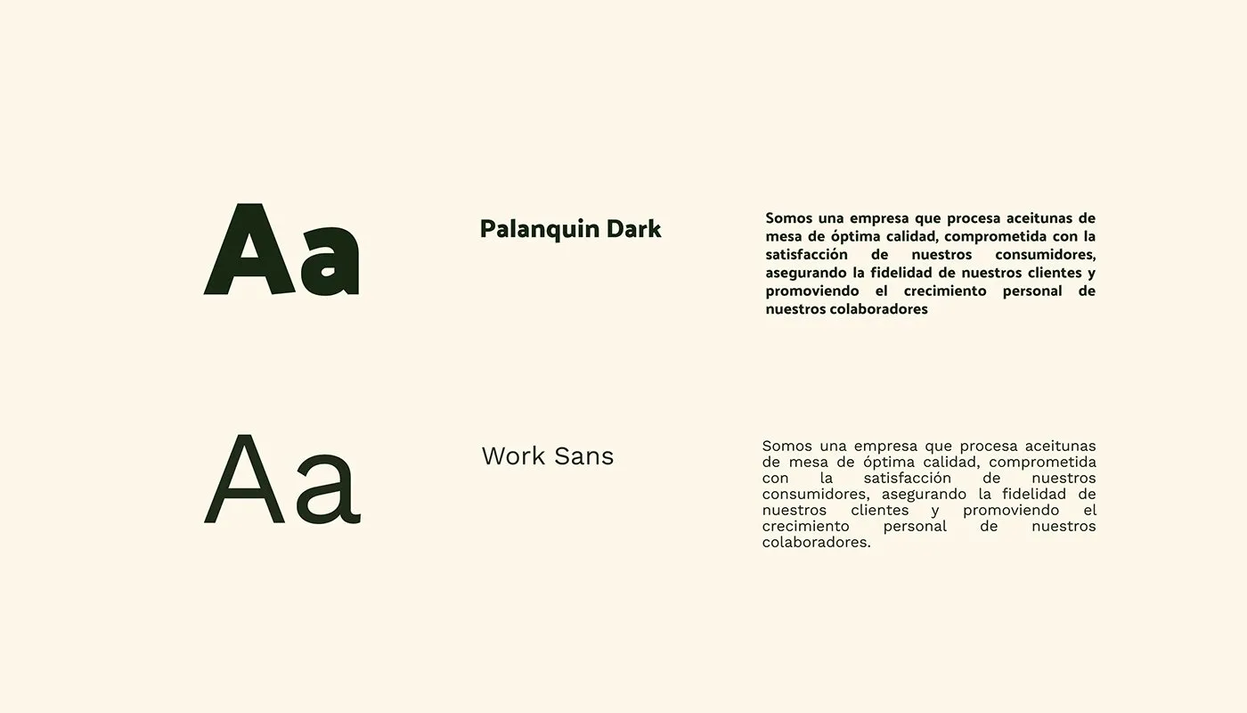
Deep olive green as the base, an oil cream and red as the origin accent. Palanquin Dark for headlines and Work Sans for text.
Applications
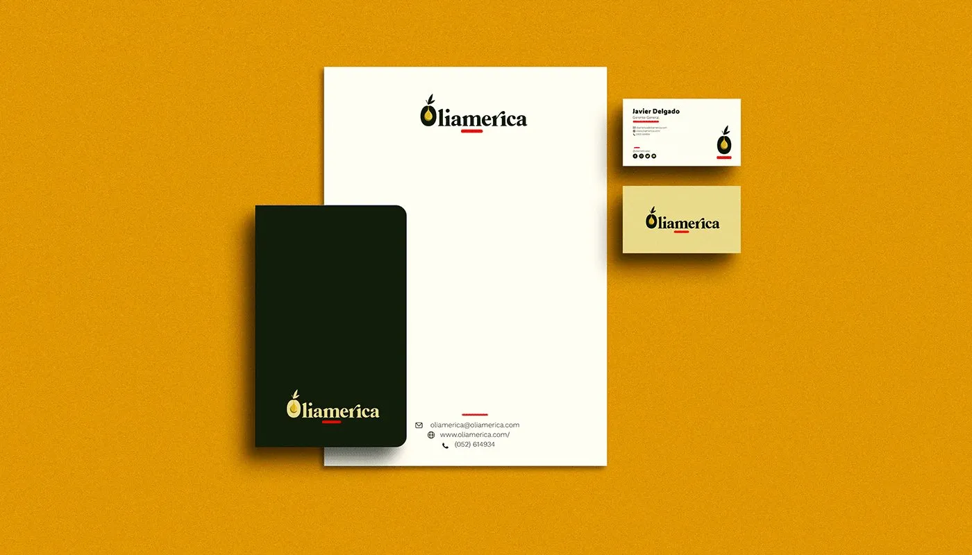
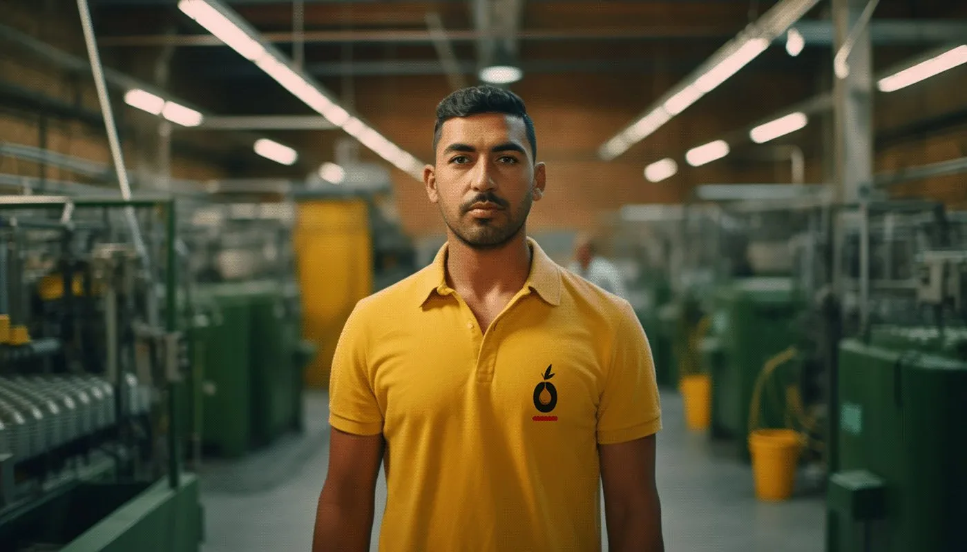
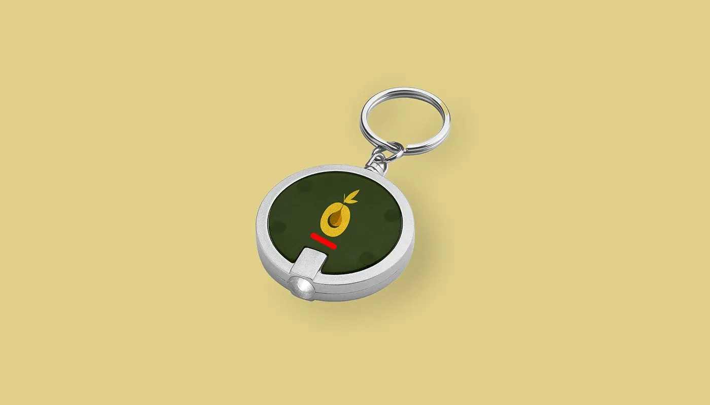
The list came from the brief: stationery, folder, polo shirts for plant workers and merchandise for factory visits.
The website
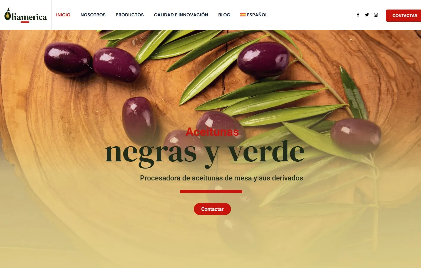
The agency also built its website, in Spanish and English, designed for importers arriving from abroad.
Result
Oliamérica traded its old logo for an identity to present itself to importers in Europe and Brazil, and took it to its plant, its stationery and its bilingual website.
Tell me about your project.
I answer every message personally. Leave your details in the form or write to me at:
yo@alejandroadriazola.com