Freeze and roll
- Industry
- Food service
- Year
- —
- My role
- Design of the approved identity at the Liberte agency
- Disciplines
- Brand identity
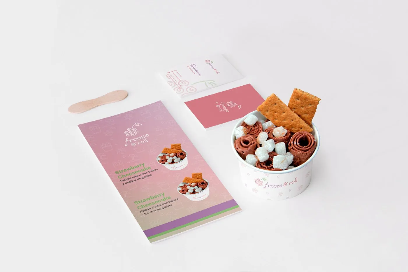
Identity for a rolled ice cream shop: a natural, healthy treat.
My role
I designed the identity option that was approved, at the Liberte agency.
The brief
Freeze & Roll is a rolled ice cream shop, the kind prepared on a cold plate and served in rolls. Its audience was students at the Catholic University of Santa María in Arequipa, and it wanted an identity that expressed its values.
A natural, healthy treat.
The logo
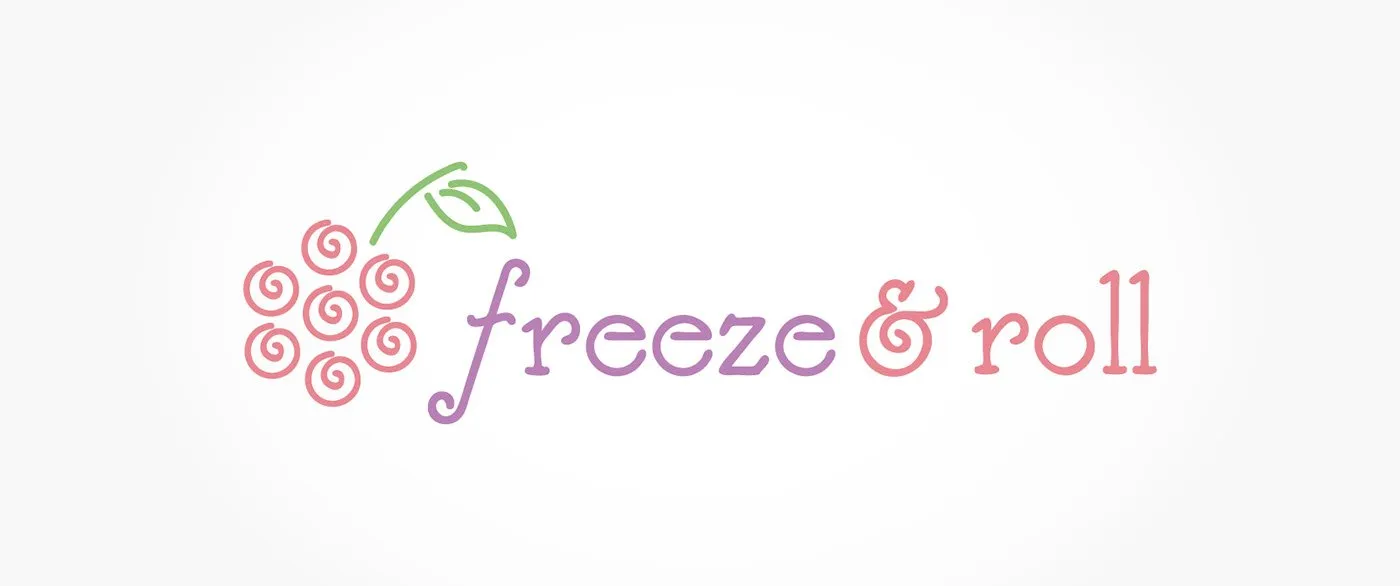
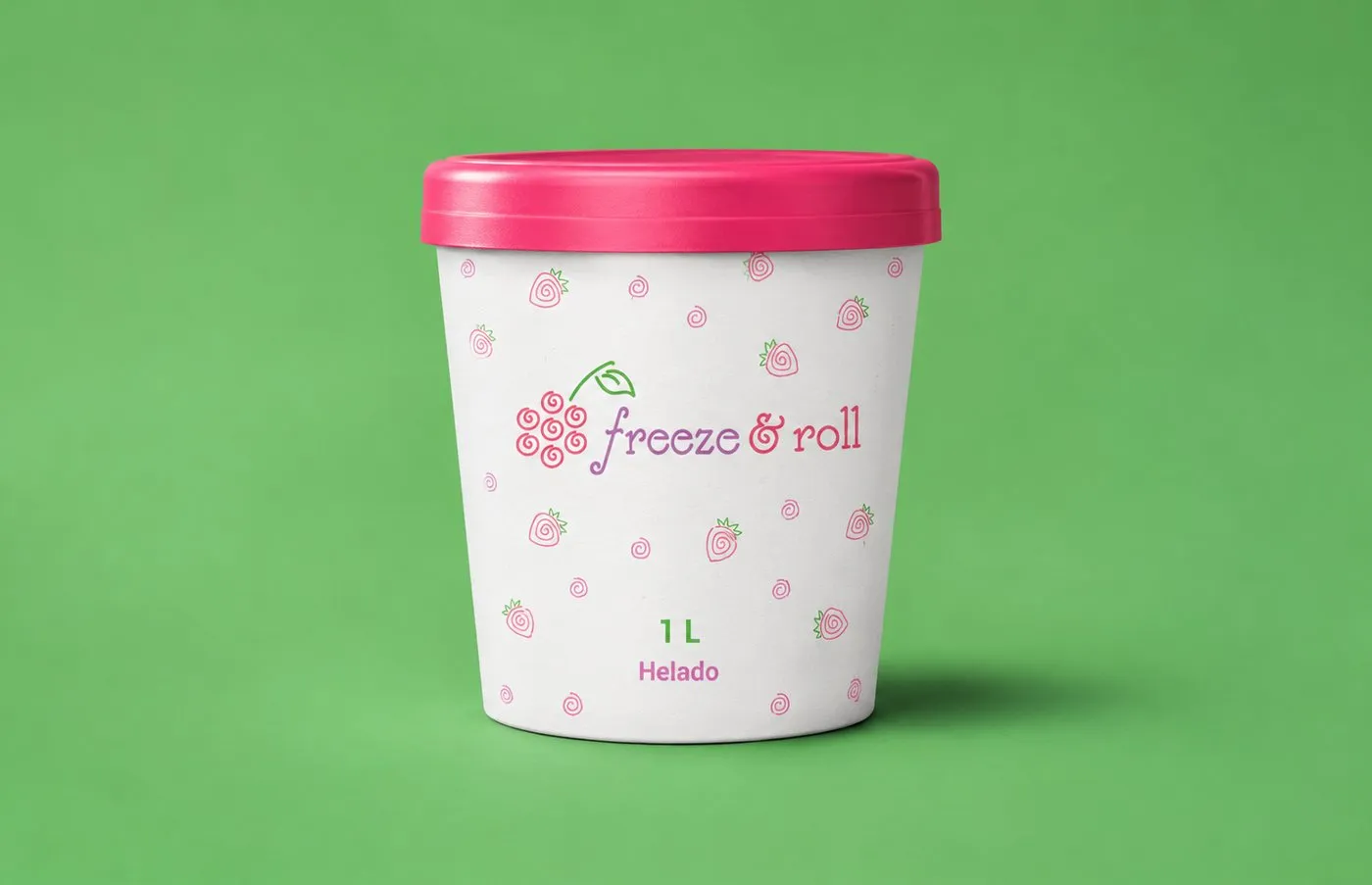
The concept is rolled ice cream. In the typography, the ampersand carries that same roll. And since its flavors were red berries, the symbol is a red berry made of spirals: that's what a serving of rolled ice cream looks like from above. The fruit also links the brand to what is natural and healthy.
Color
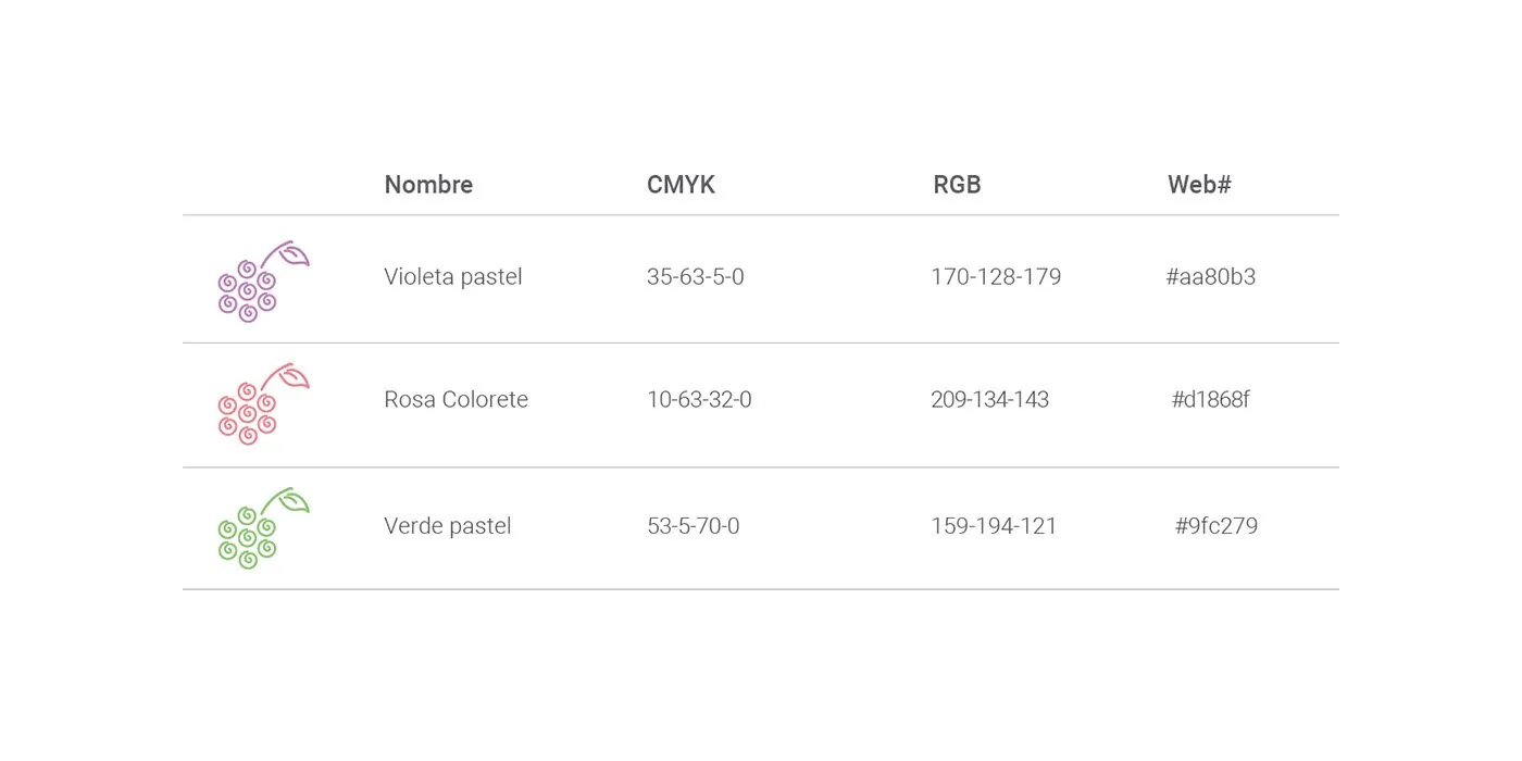
Three pastels: violet, pink and green, the tones of the fruit and the ice cream.
Applications
The one-liter tub, with the logo and a strawberry pattern.
Result
Freeze & Roll came out with an identity that tells its product in a single symbol: natural fruit and rolled ice cream.
Tell me about your project.
I answer every message personally. Leave your details in the form or write to me at:
yo@alejandroadriazola.com