Flexicash

- Industry
- Financial services
- Year
- 2017
- My role
- Project management and identity design at the Liberte agency
- Disciplines
- Brand identity, Web and UX
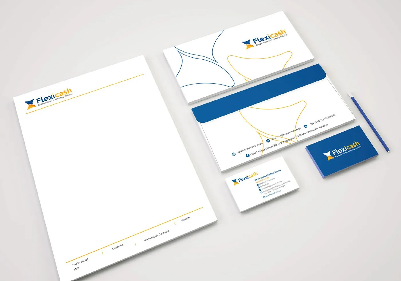
Identity and website for a savings and credit cooperative that only had a name.
My role
I managed the project and designed the identity, the option that was approved. The website was developed by another team at the Liberte agency.
The brief
Flexicash, a savings and credit cooperative, was already making loans with its name as its only identity. It needed clients to remember the brand and wanted to promote its offer, so it decided to create a brand and a website.
Flexible, friendly and sober.
The proposal
We proposed a brand built on three values. Flexibility, because clients can propose their own payment terms. Friendliness, because it seeks to connect with empathy. And sobriety, because it is still a financial institution.
The logo
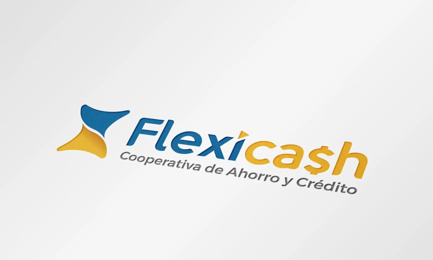
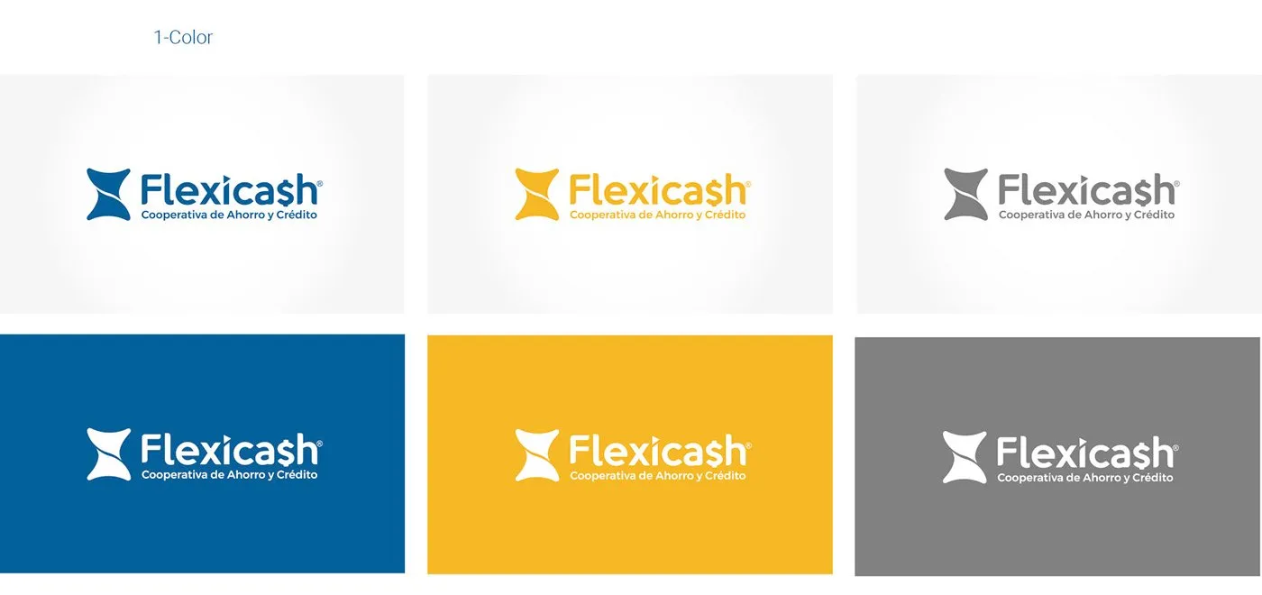
Organic shapes dominate. The symbol is abstract: a banknote turning, to express flexibility. Blue brings sobriety and trust; yellow, approachability. The S in “cash” becomes the money symbol.
Color and typography
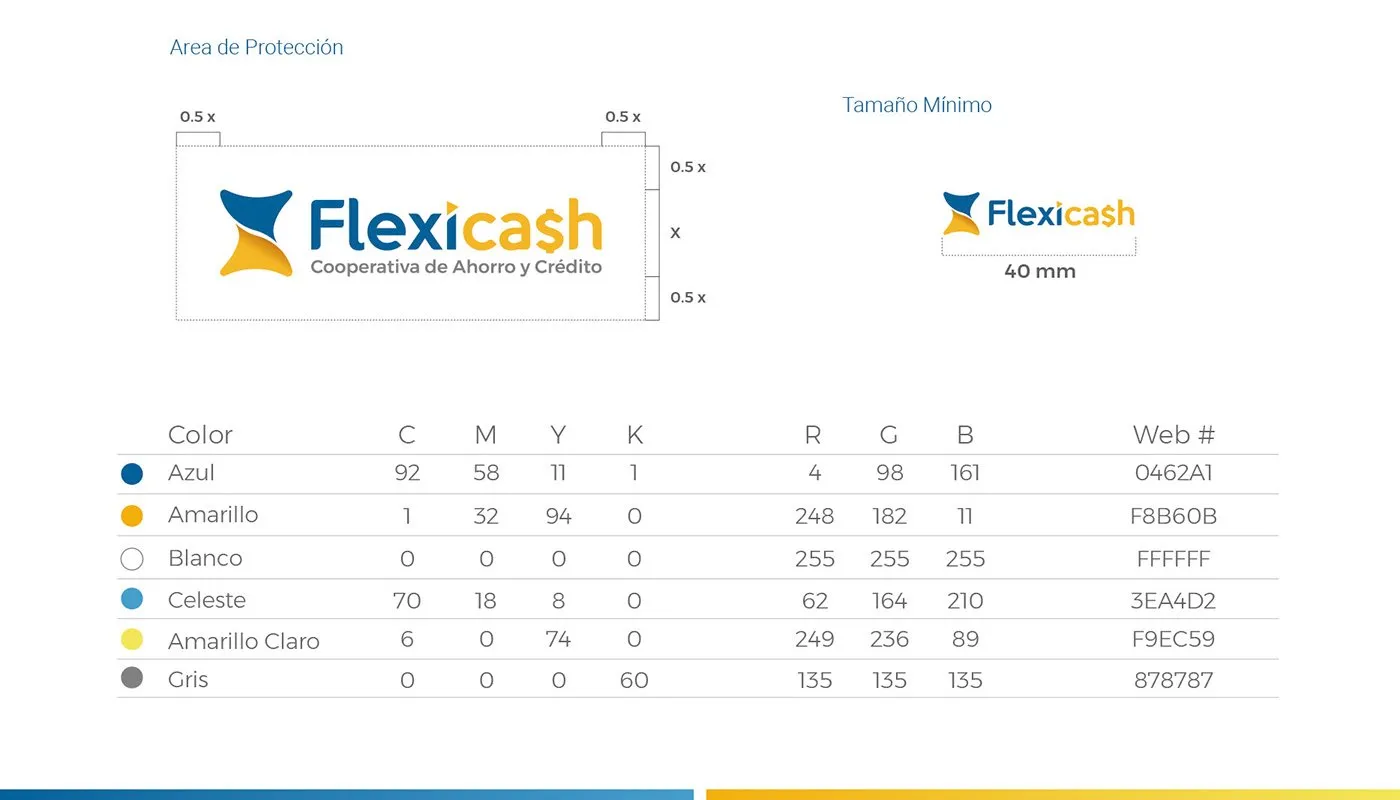
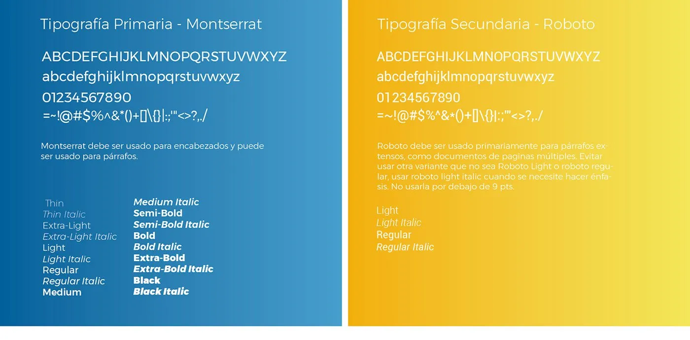
Blue and yellow as main colors, with light blue, pale yellow and gray as support. Montserrat for headings and Roboto for text.
Applications
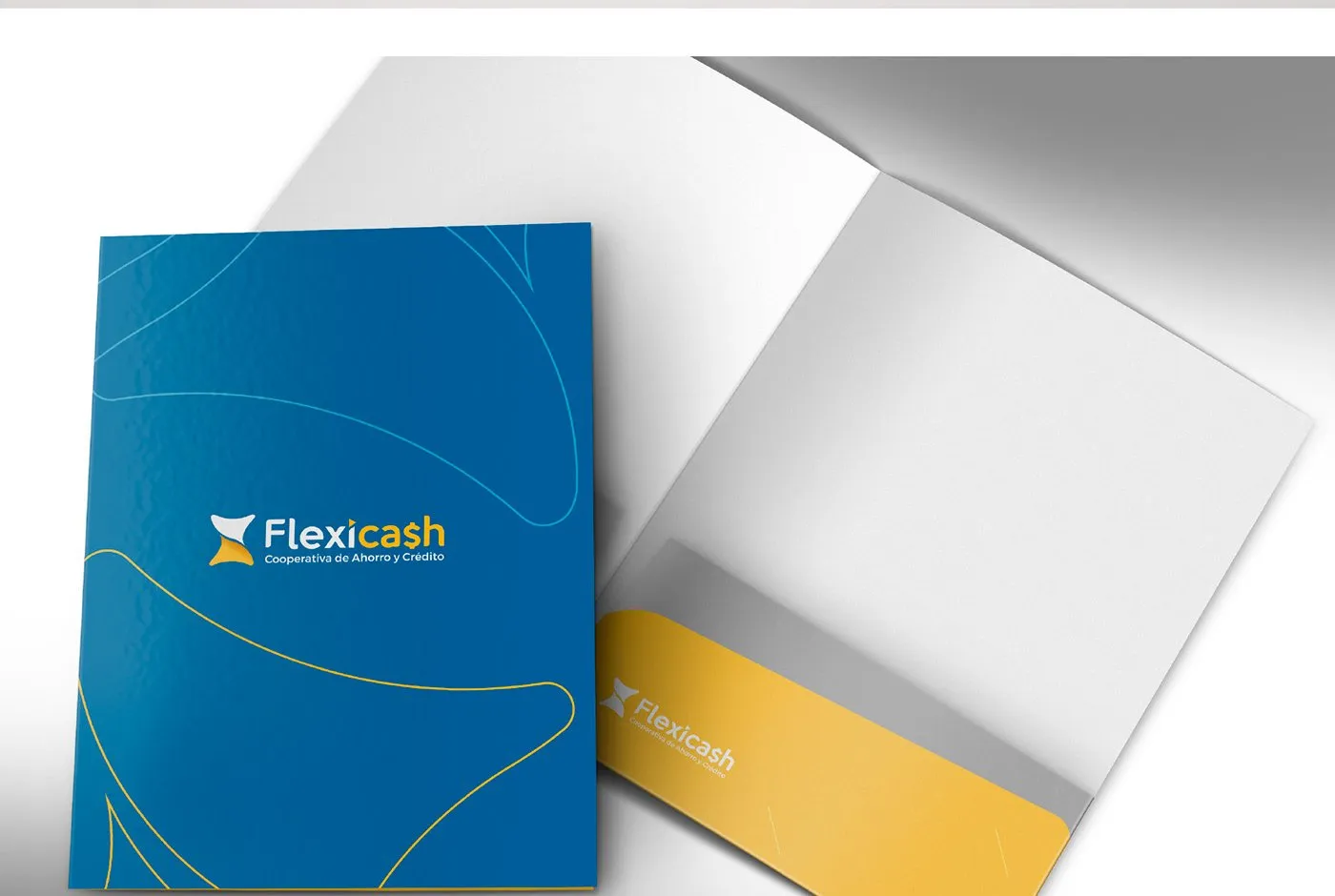
The banknote stroke becomes a pattern that runs through the stationery and the folder.

The website
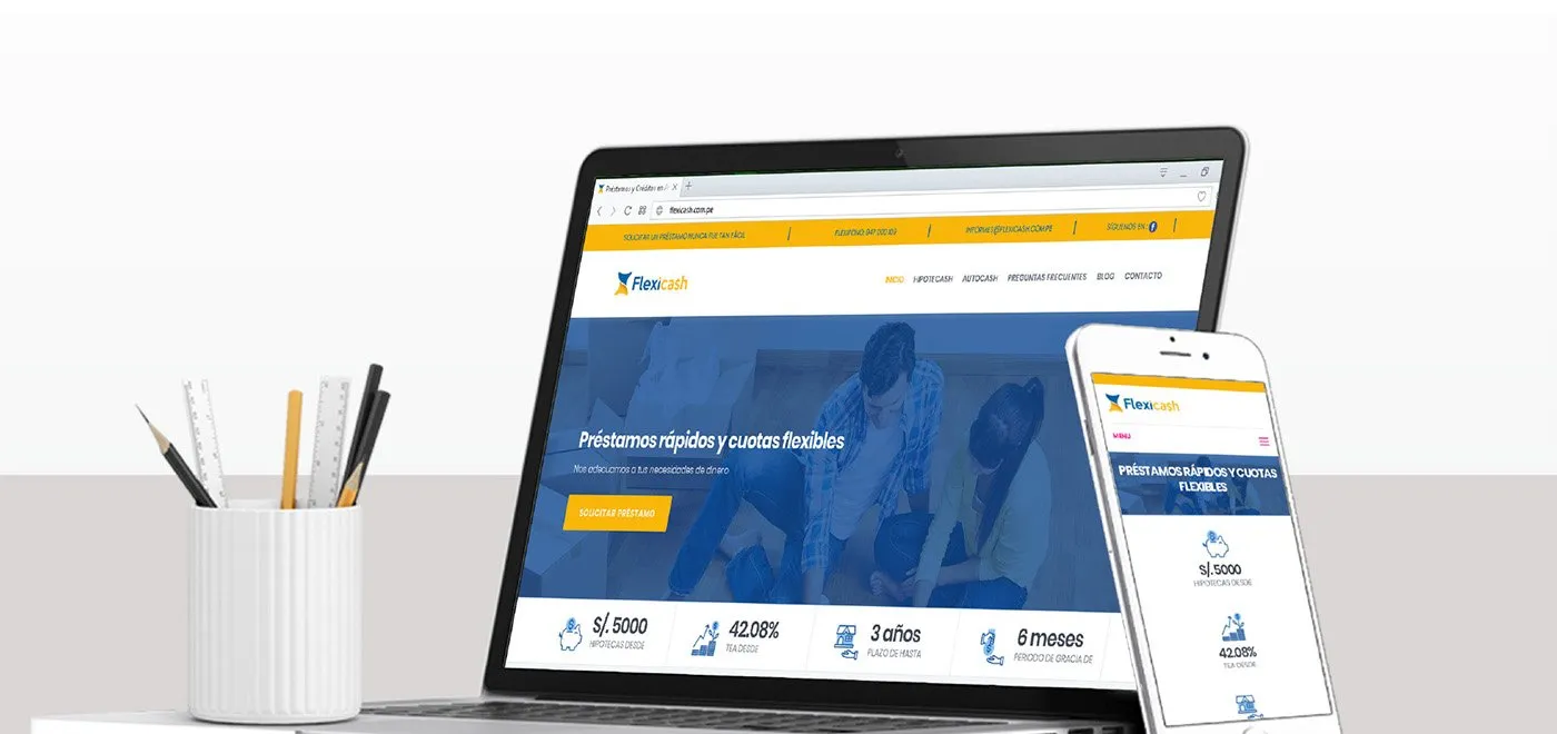
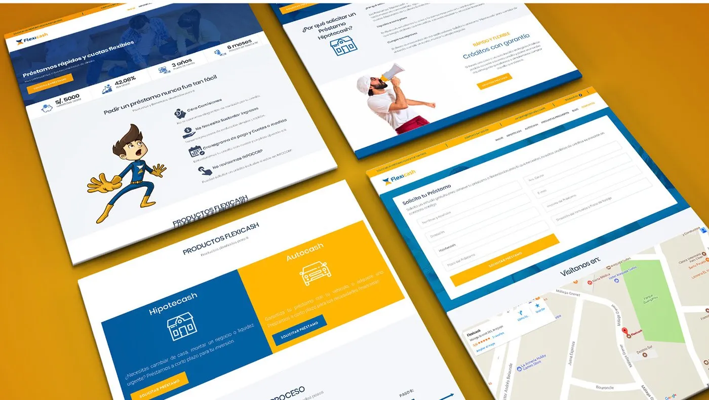
A website to inform and connect with its audience: its products and where to find them.
Result
Flexicash went from being just a name to having a brand and a website to present itself to its clients.
Tell me about your project.
I answer every message personally. Leave your details in the form or write to me at:
yo@alejandroadriazola.com