Ale Fernandez
- Industry
- Fashion
- Year
- 2026
- My role
- Logo design at the Liberte agency
- Disciplines
- Brand identity
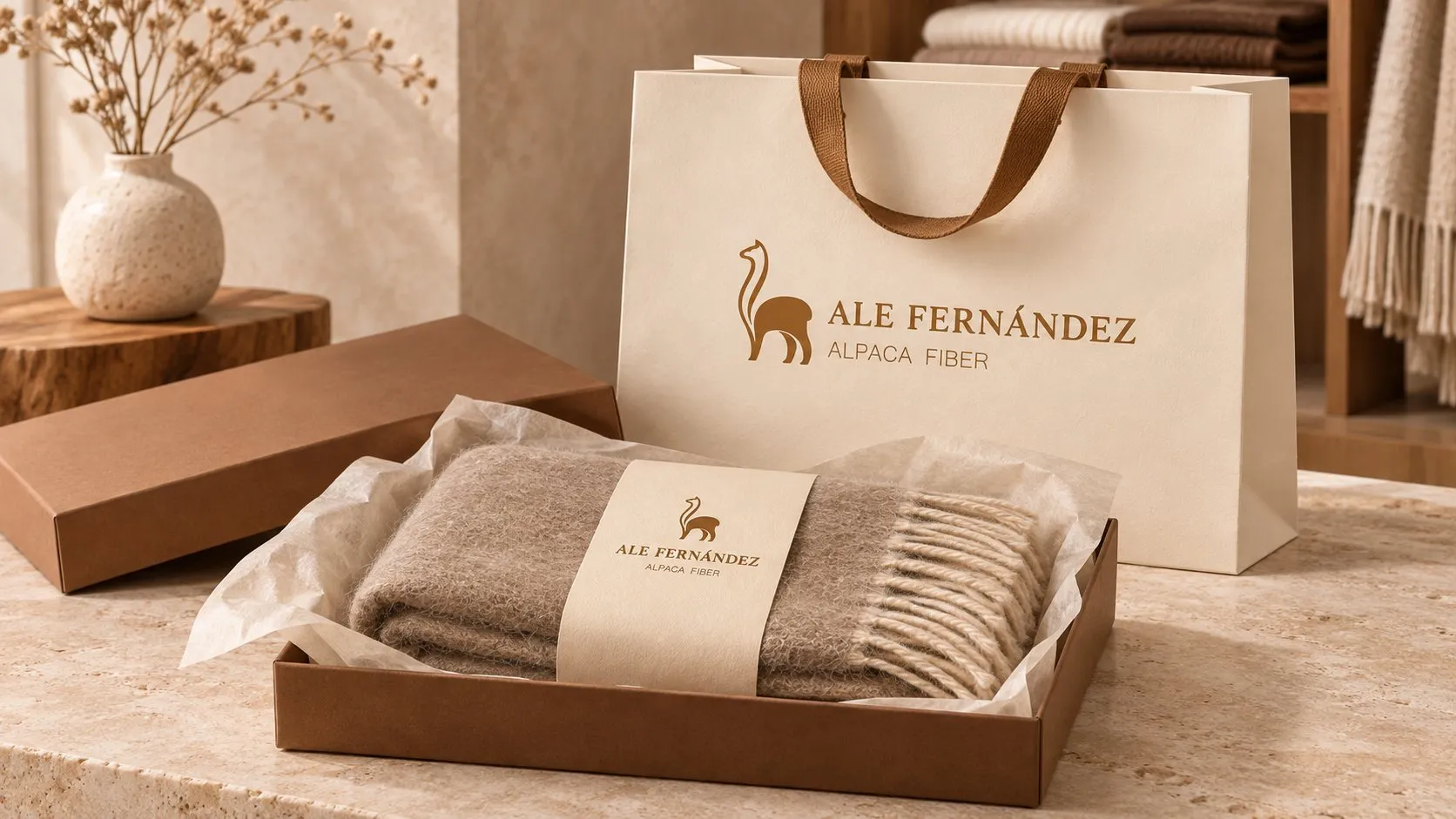
The restyling of an alpaca fiber apparel brand: the same alpaca, now more premium.
My role
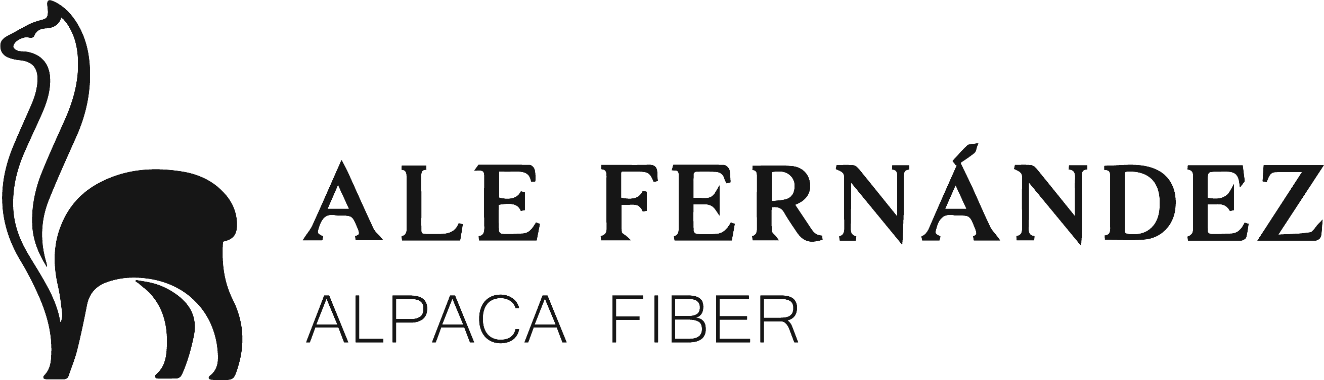
I designed the logo. The idea was to refresh the brand identity with a restyling that looked more premium.
The brief
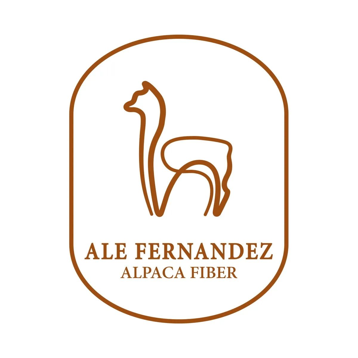
Ale Fernández makes alpaca fiber garments. Its logo had a line-drawn alpaca inside an arch. The brand wanted to look more premium without losing what already made it recognizable.
Before and after
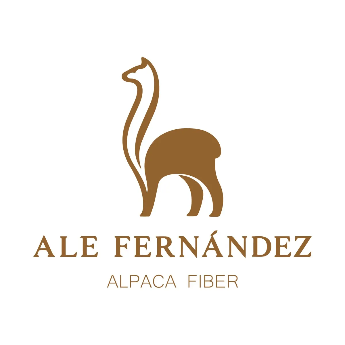
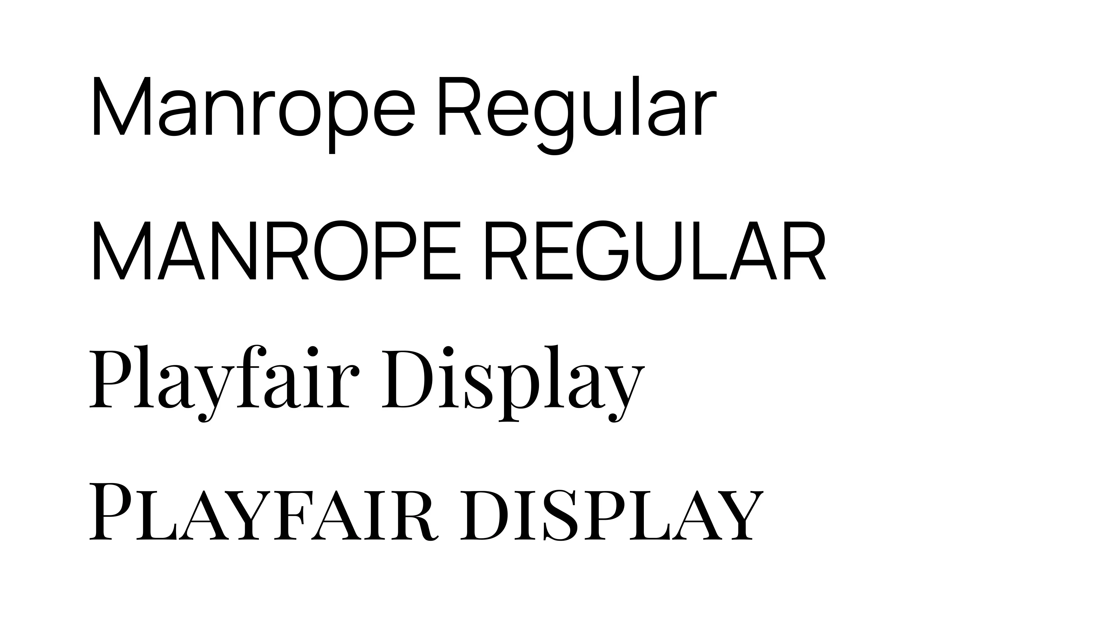
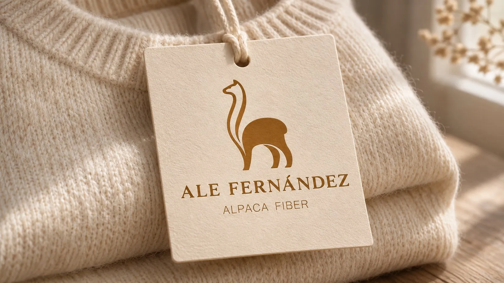
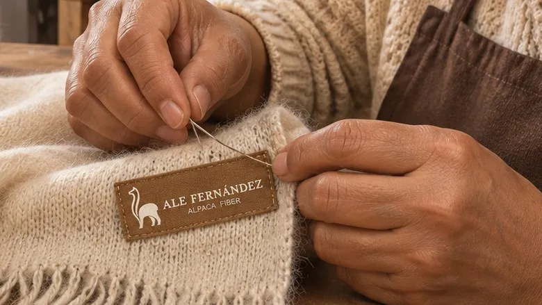
The alpaca stopped being an outline and gained volume: the body is a single solid shape and the neck a long, elegant stroke. The name moved to a serif typeface with more space between letters, and the arch became optional.
Color and typography
A warm brown, like the natural fiber, paired with cream, beige and a dark wine. Playfair Display for the name and Manrope for text.

Applications
Result
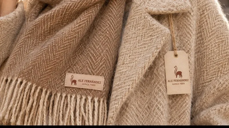
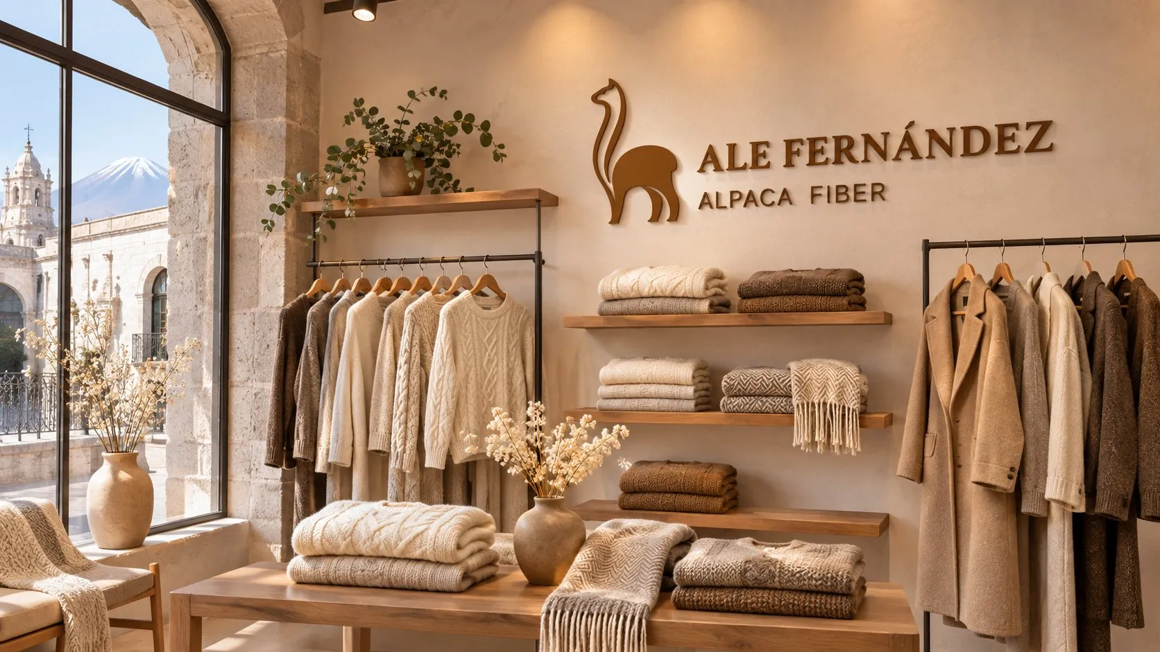
The brand came out with a more premium identity, matching its garments. Later, the agency built its e-commerce website.
Tell me about your project.
I answer every message personally. Leave your details in the form or write to me at:
yo@alejandroadriazola.com